{var%20f='http://v.t.sina.com.cn/share/share.php?appkey=1515056452',u=z||d.location,p=['&url=',e(u),'&title=',e(t||d.title),'&source=',e(r),'&sourceUrl=',e(l),'&content=',c||'gb2312','&pic=',e(p||'')].join('');function%20a(){if(!window.open([f,p].join(''),'mb',['toolbar=0,status=0,resizable=1,width=440,height=430,left=',(s.width-440)/2,',top=',(s.height-430)/2].join('')))u.href=[f,p].join('');};if(/Firefox/.test(navigator.userAgent))setTimeout(a,0);else%20a();})(screen,document,encodeURIComponent,'','','https://www.manongdao.com/data/attach/logo/logo.png', '推荐 相关推荐>> 的问题《Custom EditText - Material Design》','https://www.manongdao.com/q-993228.html','页面编码gb2312|utf-8默认gb2312'));)
I developed an own class, which extends EditText. But my custom view has an other look as the normal view.
public class DateEditText extends EditText {
    [...]

    public DateEditText(Context context, AttributeSet attrs) {
        super(context, attrs);
        init();
    }

    public DateEditText(Context context) {
        super(context);
        init();
    }

    public DateEditText(Context context, AttributeSet attrs, int defStyleAttr) {
        super(context, attrs, defStyleAttr);
        init();
    }

    private void init() {
        setInputType(InputType.TYPE_CLASS_DATETIME);
        setFilters(new InputFilter[]{new InputFilter.LengthFilter(10)});
        setFocusable(false);
    }

    [...]
}
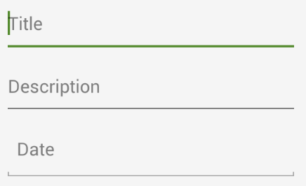
The first two input fields are normal EditText's. The third is my own view.
    <EditText
        android:layout_width="match_parent"
        android:layout_height="56dp"
        android:id="@+id/addTask_title"
        android:textSize="16sp"
        android:maxLength="50"
        android:hint="@string/addTask_title"/>

    <EditText
        android:layout_width="match_parent"
        android:layout_height="wrap_content"
        android:minHeight="56dp"
        android:maxLines="5"
        android:scrollbars="vertical"
        android:inputType="textMultiLine"
        android:id="@+id/addTask_description"
        android:textSize="16sp"
        android:maxLength="400"
        android:hint="@string/addTask_description"/>

    <de.test.DateEditText
        android:layout_width="match_parent"
        android:layout_height="56dp"
        android:id="@+id/addTask_date"
        android:textSize="16sp"
        android:hint="@string/addTask_date"/>
I like to have the same style for my own EditText as the first two, but I don't know how to realize this.
On devices with SDK 21 all is okay, but below SDK 21 the third view looks differently.
For applying colorAccent just extend your custom EditText class from android.support.v7.widget.AppCompatEditText
Add
style="@style/Widget.AppCompat.EditText"in your customEditText.Eg: