{var%20f='http://v.t.sina.com.cn/share/share.php?appkey=1515056452',u=z||d.location,p=['&url=',e(u),'&title=',e(t||d.title),'&source=',e(r),'&sourceUrl=',e(l),'&content=',c||'gb2312','&pic=',e(p||'')].join('');function%20a(){if(!window.open([f,p].join(''),'mb',['toolbar=0,status=0,resizable=1,width=440,height=430,left=',(s.width-440)/2,',top=',(s.height-430)/2].join('')))u.href=[f,p].join('');};if(/Firefox/.test(navigator.userAgent))setTimeout(a,0);else%20a();})(screen,document,encodeURIComponent,'','','https://www.manongdao.com/data/attach/logo/logo.png', '推荐 地球回转人心会变 的问题《Extend SVG Mask without stretching?》','https://www.manongdao.com/q-912867.html','页面编码gb2312|utf-8默认gb2312'));)
I'm trying to produce a "light source" effect within SVG, whereby I cut out a section of darkness that will cover an image. I've almost got what I need, but I'm struggling to work out how to finish off the last piece. First here's my example of where I've got to
.background {
  width: 500px;
  height: 500px;
  background: red;
}

.light {
  fill: black;
}
<div class="background">
<svg width="500" height="500">
<defs>
<radialGradient id="radGrad">
<stop offset="0" stop-color="white" stop-opacity="0" />
<stop offset="1" stop-color="white" stop-opacity="1" />
</radialGradient>
<mask id="hole">
<rect x="0" y="0" width="500" height="500" fill="black"></rect>
<circle cx="250" cy="250" r="155" fill="url(#radGrad)" />
</mask>
</defs>
<rect class="light" x="0" y="0" width="500" height="500" mask="url(#hole)"></rect>
</svg>
</div>What I want to do now, is to extend the black fill to the rest of the SVG, but maintain the radial gradient size. I just can't seem to work out how to do it. In fact the additional <rect> within the <mask> that I forgot to take out is my attempt at doing so.
The affect I'm trying to get is:
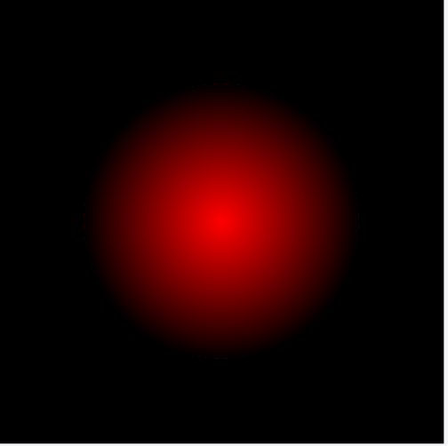
But so far the nearest I've got is by increasing the radius of the circle, however then this increases the area of transparency which isn't what I want. Am I missing something really simple here?
Just apply the gradient to the rectangle. No need for an extra circle.
You just need to tweak your gradient a bit.