{var%20f='http://v.t.sina.com.cn/share/share.php?appkey=1515056452',u=z||d.location,p=['&url=',e(u),'&title=',e(t||d.title),'&source=',e(r),'&sourceUrl=',e(l),'&content=',c||'gb2312','&pic=',e(p||'')].join('');function%20a(){if(!window.open([f,p].join(''),'mb',['toolbar=0,status=0,resizable=1,width=440,height=430,left=',(s.width-440)/2,',top=',(s.height-430)/2].join('')))u.href=[f,p].join('');};if(/Firefox/.test(navigator.userAgent))setTimeout(a,0);else%20a();})(screen,document,encodeURIComponent,'','','https://www.manongdao.com/data/attach/logo/logo.png', '推荐 Rolldiameter 的问题《Calculate height of div based off width & maintain》','https://www.manongdao.com/q-760128.html','页面编码gb2312|utf-8默认gb2312'));)
This question already has an answer here:
- Maintain the aspect ratio of a div with CSS 22 answers
I am looking for a pure CSS solution to what I have here done using jQuery to help.
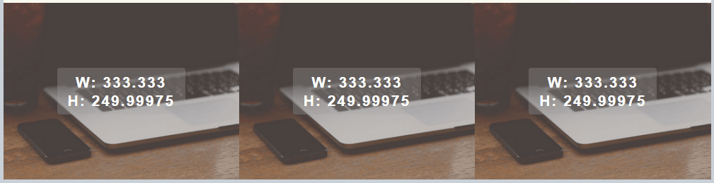
Basically I have 3 divs that spread evenly in width in a container. They maintain a 3/4 ration with the height being calculated off of the width. Furthermore, each div has a background image that stays proportional and some text that is centered horizontally and vertically.
$(document).ready(function() {
  function setw() {
    var footdivwidth = $('footer div').width();
    var footdivheight = footdivwidth * .75;
    $('footer div').css({
      'height': footdivheight + 'px'
    });
    $('footer div span').html('w: ' + footdivwidth + '<br>h: ' + footdivheight);
  }
  setw();
  $(window).resize(function() {
    setw();
  })
});
FOOTER {
max-width: 1000px;
margin: 0 auto;
background-color: rgba(0, 0, 0, 0.171);
display: flex;
flex-wrap: wrap;
justify-content: space-between;
}
FOOTER DIV {
background-image: url('https://learnwebdesign.online/img/bg.jpg');
background-position: center;
background-size: cover;
background-repeat: no-repeat;
flex: 1;
text-align: center;
display: flex;
align-items: center;
justify-content: center;
}
FOOTER DIV SPAN {
display: inline-block;
text-align: center;
background-color: rgba(165, 165, 165, 0.282);
padding: 7px 15px;
border-radius: 3px;
color: #FFFFFF;
text-transform: uppercase;
font-weight: bold;
letter-spacing: 2px;
font-size: 21px;
}<script src="https://cdnjs.cloudflare.com/ajax/libs/jquery/3.3.1/jquery.min.js"></script>
<footer>
<div><span>left photo</span></div>
<div><span>center photo</span></div>
<div><span>right photo and more text</span></div>
</footer>Here is a pen showing what I have. https://codepen.io/nom3d/pen/arGpBV
Here is a gif showing the effect when resized. Note the background image staying proportional and text staying centered.
Also wondering if it's not possible with just CSS, how to do this with plain javascript, would I need to add id's to my divs?
Update: here is a plain javaScript function to handle this task
function setHeight(el,val){
    var box = document.querySelectorAll(el);
    var i;
    for(i = 0;i < box.length;i++){
        var width = box[i].offsetWidth;
        var height = width * val;
        box[i].style.height = height + 'px';
    }
}
// set your element to target and the ratio value
setHeight('footer div',.75);
window.onresize = function(event) {
    setHeight('footer div',.75);
};
Have you tried with
there is also calc property for css which could be helpful
https://developer.mozilla.org/en-US/docs/Web/CSS/calc
Probably a bit late, but will add my solution as well.
I thought I should keep it a general solution, so I decided to not use your Footer classes. But I'm sure you'll get the trick.
In my opinion the easiest way is to use the padding calculation to get a fixed ratio and some divs.
Here's a fiddle to play around, some comments are in the code: https://jsfiddle.net/Hoargarth/Lry5gbsq/ Feel free to ask if you need anything
Just a quick note on all of those containers: You could do it with just the flex-item and one other container. But in my opinion, with the extra container it get's more flexible if you need any hover-events, animations or som other exotic stuff. For the simple solution see this fiddle: https://jsfiddle.net/Hoargarth/m57b9jcw/