{var%20f='http://v.t.sina.com.cn/share/share.php?appkey=1515056452',u=z||d.location,p=['&url=',e(u),'&title=',e(t||d.title),'&source=',e(r),'&sourceUrl=',e(l),'&content=',c||'gb2312','&pic=',e(p||'')].join('');function%20a(){if(!window.open([f,p].join(''),'mb',['toolbar=0,status=0,resizable=1,width=440,height=430,left=',(s.width-440)/2,',top=',(s.height-430)/2].join('')))u.href=[f,p].join('');};if(/Firefox/.test(navigator.userAgent))setTimeout(a,0);else%20a();})(screen,document,encodeURIComponent,'','','https://www.manongdao.com/data/attach/logo/logo.png', '推荐 Luminary・发光体 的问题《re-size the modal dialog in bootstrap dynamically》','https://www.manongdao.com/q-563138.html','页面编码gb2312|utf-8默认gb2312'));)
I have a Modal Popup (Bootstrap) which displays content based on the user selection
This is the javascript code that i've used to check for the users selection
PlayerMP.getFunctionalDetails = function (type, UserID, SessionID, SessionNo) {
$.ajax({
    type: "GET",
    url: PlayerMP.URL,
    data: "rt=4&type=" + type + "&UserID=" + UserID + "&SessionID=" + SessionID + "&SessionNo=" + SessionNo,
    success: function (FunctionalSplitsJS) {
        if (FunctionalSplitsJS.indexOf("SessionExpired=1", 0) == -1) {

            $("#divFunctionalDetails").html(FunctionalSplitsJS);
            switch (type) {
                case 1:
                    $("#divFunctionalsSplit");      //the table goes out of the modal window
                     break;
                case 2:
                    TallyFunctionalSheet();
                    $("#divFunctionalsSplit");
                    break;
                case 3:
                    $("#divFunctionalsSplit");
                    break;
            }

             $("#divFunctionalsSplit").modal('show');
        }
        else
            window.location.href = "../Login.aspx?SessionExpired=1";
    }
});
}
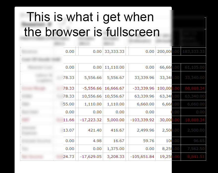
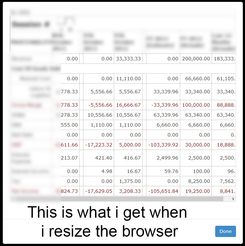
- The first case has a table which is supposed to be displayed inside the modal popup but the table goes outside the modal window (there is a problem with the width of the modal window but the
table-responsiveseem to be working) But when i resize the browser to match the width of the tablet the table/modal auto resizes to match each other. - The width of the 2nd and the 3rd case's of the modal seem to work fine.
This is the code for the modal window thats being called
 <div class="modal fade" id="divFunctionalsSplit" tabindex="-1" role="dialog" aria-hidden="true">
        <div class="modal-dialog">
            <div class="modal-content">
                  <div class="modal-body">
                    <div class="table-responsive">
                        <div id="divFunctionalDetails"></div>
                      </div>
                   </div>
                   <div class="modal-footer">
                   <button type="button" class="btn btn-primary" data-dismiss="modal">Done</button>
                   </div>
            </div>
        </div>
 </div>
- Fullscreen Browser
- Resized Browser
By default boottrap sets the width of the .modal-dialog to 600px (large screens above 768 px) or auto (small screens). The code below overwrite this:
(based on: https://stackoverflow.com/a/16152629/2260496)
To make it more dynamically you will need to calculate the width (jQuery width() or innerwidth())of your table and set the width of the modal-dialog according it.
See: http://bootply.com/88364
I had the same problem and found that the issue was not the modal itself. I added an ID to each element inside of the and via CSS just add a width:100% to all of them.
It worked for me.
This worked for me atleast:
Change this to your code
and this
If you set
display: table;inside the div holding the modal it'll resize accordingly. My modal is draggable and doesn't resize when you change the size of the browser, but this is the only workable solution I found for dynamic modal sizes.