{var%20f='http://v.t.sina.com.cn/share/share.php?appkey=1515056452',u=z||d.location,p=['&url=',e(u),'&title=',e(t||d.title),'&source=',e(r),'&sourceUrl=',e(l),'&content=',c||'gb2312','&pic=',e(p||'')].join('');function%20a(){if(!window.open([f,p].join(''),'mb',['toolbar=0,status=0,resizable=1,width=440,height=430,left=',(s.width-440)/2,',top=',(s.height-430)/2].join('')))u.href=[f,p].join('');};if(/Firefox/.test(navigator.userAgent))setTimeout(a,0);else%20a();})(screen,document,encodeURIComponent,'','','https://www.manongdao.com/data/attach/logo/logo.png', '推荐 Summer. ? 凉城 的问题《WKWebView viewport shrink-to-fit not working on iO》','https://www.manongdao.com/q-529777.html','页面编码gb2312|utf-8默认gb2312'));)
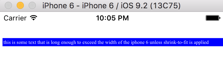
In iOS 9.2, a WKWebView rendering HTML with fixed-width tables bigger than the device width could be told to shrink the content to fit by adding a viewport tag like this:
<meta name="viewport" content="width=device-width, shrink-to-fit=YES">
This line caused the WKWebView to effectively zoom out the viewport so that the entire rendered page fit in the view frame without the need for scrollbars. For example, consider the following code, when run in viewDidLoad in a vanilla single view app:
WKWebViewConfiguration *wkWebConfig = [[WKWebViewConfiguration alloc] init];
WKWebView *newWebView = [[WKWebView alloc] initWithFrame:CGRectMake(0,40,self.view.frame.size.width, self.view.frame.size.height - 40) configuration:wkWebConfig];
NSString *toRender = @"<head><meta name=\"viewport\" content=\"width=device-width, shrink-to-fit=YES\"></head><body><table width=700 style='background-color: blue; color:white; font-size=20px'><tr><td>this is some text that is long enough to exceed the width of the iphone 6 unless shrink-to-fit is applied</td></tr></table></body>";
[newWebView loadHTMLString:toRender baseURL:nil];
[self.view addSubview:newWebView];
The content renders like this:
However, this behavior has changed in 9.3. The identical code running in 9.3 renders like this:
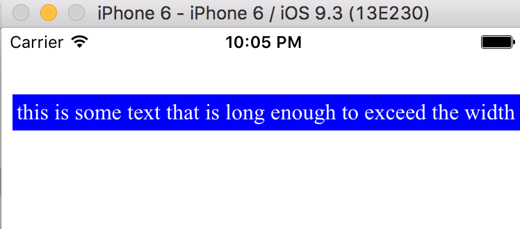
(Although you can't see it in the screenshot, there is a horizontal scrollbar)
Searching other questions on stackoverflow and elsewhere, it seems like most other people prefer the 9.3 behavior. However, I need the 9.2 behavior, of shrink-to-fit. So, my question is: does anyone know how to get the same shrink-to-fit behavior in 9.3? And does anyone know if this change is intentional, or a bug that's going to be fixed in subsequent releases?
My test code can be found at https://github.com/nsolter/NSWebViewShrinkTest, specifically https://github.com/nsolter/NSWebViewShrinkTest/blob/master/NSWebViewShrinkTest/ViewController.m
I filed a bug report with Apple, and this is the response:
"No, we don’t want to maintain shrink-to-fit behavior. The workaround is to use a viewport meta tag that correctly describes the width of the content."
I tried this out. If, in the viewport tag, you specify a width of the actual width of the html after it's rendered, it will display properly on your device width. In my example above, with a table width of 700, if you specify:
<meta name=\"viewport\" content=\"width=700, shrink-to-fit=YES\">Then the page will display without horizontal scrollbars.
Note that you can't specify an initial-scale viewport property, though. Then it doesn't display with the proper width.
This is obviously less than ideal, because you generally don't know what the width of your rendered html will be until you render it. My current solution is to render it once with width=device-width, then render it again with width=X, where X is the actual width of the rendered page the first time.