Android background + text + icon for a button

2019-03-25 14:17发布

I would like to have an image set to background a text on it and an icon on the left side of the text. Very easy in iPhone, but can't figure out how to do it at Android, to be resizable that button and keep the icon + text position and distance properly.
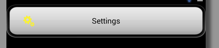
iPhone:

iPhone

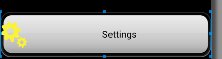
Android I have this:

Android

The xml code is:

<Button
    android:id="@+id/btSettings"
    android:layout_width="wrap_content"
    android:layout_height="wrap_content"
    android:layout_above="@id/tvWhatever"
    android:layout_centerHorizontal="true"
    android:layout_marginBottom="20dp"
    android:background="@drawable/bt_general"
    android:drawableTop="@drawable/settings_selected"
    android:text="@string/settings"
    android:textColor="#000000" />

Took the code from here.

If I use android:drawableLeft , than the icon will go to most left part.

enter image description here

If I start playing with semi hardcoded paddings, than I will have different look at diff devives: ( phone and table)

If I add the android:gravity="left|center_vertical" than it will look like this:

enter image description here

The text is variable: it will change, when the user change the language.

How to do it properly?

I don't want to downvote anybody's answer, but please read the question and don't suggest what I have tryed already. Also told the hardcoded fixes doesn't work well.

This is not a homework, but a commercial software part.

Here is a suggested code from answers:

<RelativeLayout
        android:layout_width="fill_parent"
        android:layout_height="wrap_content"
        android:background="@drawable/bt_general"
        android:padding="20dip" >

        <ImageView
            android:id="@+id/xIcon"
            android:layout_width="wrap_content"
            android:layout_height="wrap_content"
            android:layout_alignParentLeft="true"
            android:layout_centerVertical="true"
            android:layout_marginLeft="10dip"
            android:src="@drawable/settings_selected" />

        <TextView
            android:id="@+id/xSettingsTxt"
            android:layout_width="wrap_content"
            android:layout_height="wrap_content"
            android:layout_centerInParent="true"
            android:text="@string/settings"
            android:textColor="#000000" />
    </RelativeLayout>

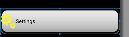
What do you think how it will look like the android:layout_marginLeft="10dip" on Galaxy s4? Here is a preview:

enter image description here

This is not, what I have asked. "dip" or "dp" or "px" shouldn't be used anywhere as distance from left, top, because phones has HPDI, smaller screen and Tablets has MDPI and wide resolutions. Simple doesn't work on mdpi, and xxhdpi.

Nizam answer is very close to a good solution:

enter image description here

14条回答
该账号已被封号
2楼-- · 2019-03-25 15:00

Try below layout

<?xml version="1.0" encoding="utf-8"?>
<RelativeLayout xmlns:android="http://schemas.android.com/apk/res/android"
android:layout_width="fill_parent"
android:layout_height="100dip"
android:orientation="horizontal"
android:background="@drawable/round_corners_drawable" >

<ImageView 
    android:id="@+id/xIcon"
    android:layout_width="wrap_content"
    android:layout_height="wrap_content"
    android:layout_alignParentLeft="true"
    android:layout_marginLeft="10dip"
    android:layout_centerVertical="true"
    android:src="@drawable/ic_launcher"/>

<TextView
    android:id="@+id/xSettingsTxt"
    android:layout_width="wrap_content"
    android:layout_height="wrap_content"
    android:text="Settings"
    android:layout_centerInParent="true" />

</RelativeLayout>

and drawable/round_corner_drawable is as below:

<?xml version="1.0" encoding="utf-8"?>

<shape xmlns:android="http://schemas.android.com/apk/res/android"
android:shape="rectangle" >

<solid android:color="#310704"/>

<corners
    android:bottomRightRadius="20sp"
    android:bottomLeftRadius="20sp"
    android:topLeftRadius="20sp"
    android:topRightRadius="20sp"/>

<gradient
    android:startColor="#99310704"
    android:centerColor="#99310704"
    android:endColor="#99310704"
    android:angle="270" />

</shape>

Also, if you want to use your image as a background, give android:layout_height="wrap_content" and set it as a background for relative layout.

p.s. If you put different color values for startColor, centerColor and endColor, you will get that gradient effect for your background drawable. So change the color values accordingly.

EDIT:

Try below layout, i edited it to fit in different screen sizes with rounded corner drawable.

<?xml version="1.0" encoding="utf-8"?>
<RelativeLayout xmlns:android="http://schemas.android.com/apk/res/android"
android:layout_width="fill_parent"
android:layout_height="wrap_content"
android:padding="20dip"
android:background="@drawable/dialog_round_corners" >

<ImageView 
    android:id="@+id/xIcon"
    android:layout_width="wrap_content"
    android:layout_height="wrap_content"
    android:layout_toLeftOf="@+id/xSettingsTxt"
    android:layout_centerVertical="true"
    android:src="@drawable/ic_launcher"/>

<TextView
    android:id="@+id/xSettingsTxt"
    android:layout_width="wrap_content"
    android:layout_height="wrap_content"
    android:text="Settings"
    android:layout_centerInParent="true" />

</RelativeLayout>
查看更多
相关推荐>>
3楼-- · 2019-03-25 15:00

I had achieved that with following code. May be used as an easier alternative to above solutions.

<Button android:id="@+id/btnUserProfile"
    android:layout_width="match_parent"
    android:layout_height="wrap_content"
    android:layout_marginLeft="8dp"
    android:layout_marginRight="8dp"
    android:drawableLeft="@drawable/ic_user_profile"
    android:background="#6C6C6C"
    android:drawablePadding="8dp"
    android:gravity="left|center_vertical"          
    android:text="@string/my_profile"
    android:textStyle="bold|italic" />   

the button view is marked in red(this is not a list item but a button with above code):

enter image description here

查看更多
做自己的国王
4楼-- · 2019-03-25 15:00

I just implemented this kind of button (and it has been deployed in a large scale app), it is not really complicated : content of large_button.xml :

<LinearLayout xmlns:android="http://schemas.android.com/apk/res/android"
    android:layout_width="match_parent"
    android:layout_height="match_parent"
    android:background="@drawable/large_button_background"
    android:clickable="true"
    android:gravity="center_horizontal"
    android:orientation="horizontal" >

    <ImageView
        android:layout_width="wrap_content"
        android:layout_height="match_parent"
        android:layout_gravity="center_vertical"
        android:layout_marginRight="16dp"
        android:src="@drawable/some_icon" />

    <com.my.app.widget.RobotoTextView
        android:id="@+id/large_button_text"
        style="@style/AppName_RobotoBold"
        android:layout_width="wrap_content"
        android:layout_height="match_parent"
        android:ellipsize="end"
        android:focusable="false"
        android:gravity="center_vertical"
        android:maxLines="1"
        android:singleLine="true"
        android:textColor="@color/text_main"
        />

</LinearLayout>

Then, to use it I just have to use the include tag :

<include
    android:id="@+id/large_button"
    android:layout_width="match_parent"
    android:layout_height="@dimen/large_button_height"
    android:layout_marginBottom="@dimen/large_button_vertical_margin"
    android:layout_marginLeft="@dimen/large_button_horizontal_margin"
    android:layout_marginRight="@dimen/large_button_horizontal_margin"
    android:layout_marginTop="@dimen/large_button_vertical_margin"
    layout="@layout/large_button" />

large_button_background is a selector that points to the different drawables to use for each button state

I used a LinearLayout, it allows to simply center both text & icons in the button. It should also be doable with a GridLayout. If you want to center just on the text (I don't think it looks great though but that's your choice), use a RelativeLayout.

查看更多
我欲成王,谁敢阻挡
5楼-- · 2019-03-25 15:02

If your button width: android:layout_width="wrap_content" then your code will be like this:

 <Button
        android:layout_width="wrap_content"
        android:layout_height="wrap_content"
        android:drawableLeft="@drawable/img name"
        android:gravity="left|center"
        android:text="Button" />

Else if your button width: android:layout_width="match_parent" then your code will be like this:

<Button
        android:layout_width="match_parent"
        android:layout_height="wrap_content"
        android:drawableLeft="@drawable/img name"
        android:gravity="left|center"
        android:text="Button"
        android:paddingLeft="100dp" 
        />

By the way android:paddingLeft="100dp", change 100 with your suitable value.

查看更多
别忘想泡老子
6楼-- · 2019-03-25 15:02
<Button
    android:id="@+id/btSettings"
    android:layout_width="wrap_content"
    android:layout_height="wrap_content"
    android:background="@drawable/back_button"
    android:drawablePadding="5dp"
    android:drawableLeft="@drawable/ic_launcher"
    android:text="Settings"
    android:padding="20dp"
    android:textColor="#000000" />

You can use paddingLeft and paddingRight to get button as the one in iphone

查看更多
Viruses.
7楼-- · 2019-03-25 15:04

Try to use TextView,

<TextView
    android:id="@+id/txtSettings"
    android:layout_width="wrap_content"
    android:layout_height="wrap_content"
    android:layout_above="@id/tvWhatever"
    android:layout_centerHorizontal="true"
    android:text="@string/settings"
    android:textColor="#000000" />

In Java

txtView.setBackgroundResources(R.drawable.bt_general);
txtView.setCompoundDrawablesWithIntrinsicBounds(Drawable left,Drawable top,Drawable right,Drawable bottom);

where Drawable image is,

Bitmap bitmap= BitmapFactory.decodeResource(context.getResources(), 
    R.drawable.settings_selected);
BitmapDrawable drawable=new BitmapDrawable(getResources(), bitmap);
查看更多
登录 后发表回答