{var%20f='http://v.t.sina.com.cn/share/share.php?appkey=1515056452',u=z||d.location,p=['&url=',e(u),'&title=',e(t||d.title),'&source=',e(r),'&sourceUrl=',e(l),'&content=',c||'gb2312','&pic=',e(p||'')].join('');function%20a(){if(!window.open([f,p].join(''),'mb',['toolbar=0,status=0,resizable=1,width=440,height=430,left=',(s.width-440)/2,',top=',(s.height-430)/2].join('')))u.href=[f,p].join('');};if(/Firefox/.test(navigator.userAgent))setTimeout(a,0);else%20a();})(screen,document,encodeURIComponent,'','','https://www.manongdao.com/data/attach/logo/logo.png', '推荐 Bombasti 的问题《How to fix IE rendering of border-radius combined》','https://www.manongdao.com/q-503869.html','页面编码gb2312|utf-8默认gb2312'));)
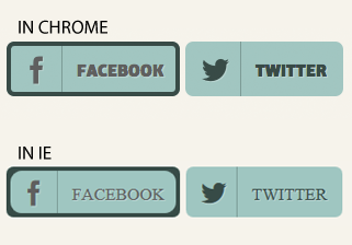
Does anybody have an idea on how to "fix" the rendering in IE 9 and 10 of a combination of box-shadow and border-radius?
It's especially noticeable when using inset shadows. The radius of the shadow is very different in IE compared to webkit/gecko...
In this image you can see the problem. On the left is a button with an inset box-shadow, on the right without box-shadow. (don't mind the different font-rendering)
Here's the code used: http://dabblet.com/gist/5450815
You can safely use
insetbox shadows to emulate borders in modern browsers, but IE mis-renders the radius. You can work around this by letting IE fall back to the default "outset" style.Try this, add this role:
The problem only occurs when the spread of the inset shadow triggers a larger "shadow-radius" than the size of the border-radius in IE. Set the border-radius to 50px in your example and it looks the same in IE and Chrome.
If you need a bigger box-shadow spread then you can just use a border instead, at least in your examples that would do the trick. Example: http://dabblet.com/gist/5501799
Another problem you might see is that IE and Chrome render the blur of the box-shadow totally different, but I assume you're not using it in your example for that reason...
A quick (semi dirty) solution, which I have tried and works, is a div inside a div. Let me know if this does it.
HTML CODE:
CSS CODE:
My jsfiddle
Try this: //CSS
For IE8 you have to include CSS3 pie(pie.htc) file then it will work on IE8.
You can download from here:
http://css3pie.com/