{var%20f='http://v.t.sina.com.cn/share/share.php?appkey=1515056452',u=z||d.location,p=['&url=',e(u),'&title=',e(t||d.title),'&source=',e(r),'&sourceUrl=',e(l),'&content=',c||'gb2312','&pic=',e(p||'')].join('');function%20a(){if(!window.open([f,p].join(''),'mb',['toolbar=0,status=0,resizable=1,width=440,height=430,left=',(s.width-440)/2,',top=',(s.height-430)/2].join('')))u.href=[f,p].join('');};if(/Firefox/.test(navigator.userAgent))setTimeout(a,0);else%20a();})(screen,document,encodeURIComponent,'','','https://www.manongdao.com/data/attach/logo/logo.png', '推荐 倾城 Initia 的问题《Wrap text around both sides of div》','https://www.manongdao.com/q-406682.html','页面编码gb2312|utf-8默认gb2312'));)
Here is what I try to achieve:
With the following HTML:
<div id="my1">
<p> some text </p>
<div id="wrap">Awesome content</div>
</div>
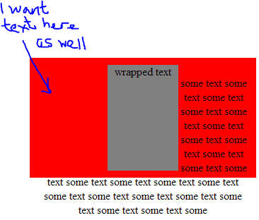
Having this:
text text text text text text text text text text text text text text
text text text text text div id="wrap" text text text text text
text text text text text text text text text text text text text text
Floating divs didn't help me reaching this result so far... (considering height and width for both my1 and wrap are known)?
A fiddle where the text starts from the right side of the wrapped div, when I wish it starts from the left of "my1" div, breaks around "wrap" div. http://jsfiddle.net/matmat/dxV4X/
Should work if I am reading the question correctly? A
<div> is a block level element which is breaking, a<span>is inline like what you want.Fiddle here: http://jsfiddle.net/YbuuH/2/
Use css as below:
This css should work to wrap the text in a line and to continue on next.
Looks like you want something like float:center ? Well, the problem is that this property doesn't exist.
Here are 2 alternatives:
1) Fake it with pseudo elements - FIDDLE - See this css-tricks article
Set up markup like so:
With CSS
Alternative #2 (IE 10+ only): CSS Exclusions - FIDDLE
Markup
CSS
For more info about CSS exclusion browser support and further resources see my answer here.