{var%20f='http://v.t.sina.com.cn/share/share.php?appkey=1515056452',u=z||d.location,p=['&url=',e(u),'&title=',e(t||d.title),'&source=',e(r),'&sourceUrl=',e(l),'&content=',c||'gb2312','&pic=',e(p||'')].join('');function%20a(){if(!window.open([f,p].join(''),'mb',['toolbar=0,status=0,resizable=1,width=440,height=430,left=',(s.width-440)/2,',top=',(s.height-430)/2].join('')))u.href=[f,p].join('');};if(/Firefox/.test(navigator.userAgent))setTimeout(a,0);else%20a();})(screen,document,encodeURIComponent,'','','https://www.manongdao.com/data/attach/logo/logo.png', '推荐 forever°为你锁心 的问题《Creating Bar Charts in Python》','https://www.manongdao.com/q-393026.html','页面编码gb2312|utf-8默认gb2312'));)
I have a couple of problems with the Bar Chart that I'm trying to create in python. My code for the chart looks like this:
import matplotlib
matplotlib.use('Agg')
from pylab import *
import calendar

def webshow(img):
    savefig(img,dpi=500)
    print 'Content-Type: text/html\n'
    print '<img width="800" height="400" src="'+img+'" />'

genres = []
n = 0
for c in sorted_list:
    genres.append(sorted_list[n][0])
    n += 1

grosses = []
a = 0
for c in sorted_list:
    grosses.append(sorted_list[a][1])
    a += 1

clf()
bar(arange(len(grosses)),grosses)
xticks( arange(len(genres)),genres, rotation=80)
webshow("barchart.png")
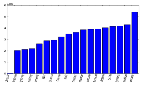
My chart looks like this:
a busy cat http://28.media.tumblr.com/tumblr_ltk9v6xShD1r5te58o1_500.png
Basically my main problem is that the values are in decimals with scientific notation. I want to present them in millions if possible. Also, I'm not sure how to make it so the genres are not cut off at the bottom. Thank you for any help!
First up, I would use a
figureobject to work on: this makes it easier to construct the plot to your liking. To construct your graph, the following should do:Along with the following remarks:
tight_layoutfunction to do this automatically for you. The alternative is to calculate the needed size by yourself based on the bounding boxes of all axes labels as shown here, but you need a renderer for this to be able to determine the sizes of all labels.sciorplain), you can change the rendering of the values. When usingplain, it will just render the value as is. See the docs on this function for more info. Note that you can also use theset_yticklabelsfunction'stextargument to control the formatting further (of course that function is also available for the x axis.