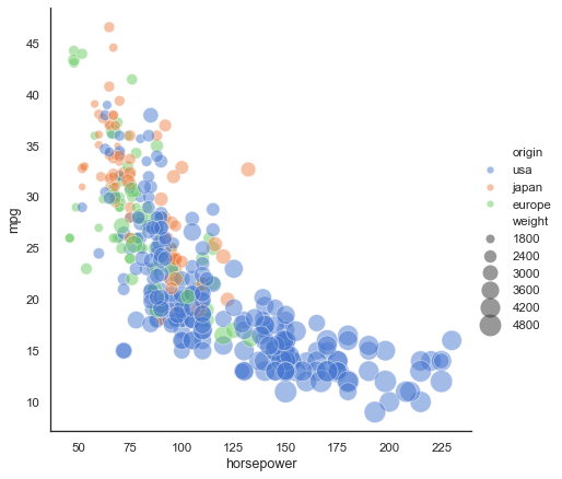
I'm trying to understand how to get the legend examples to align with the dots plotted using Seaborn's relplot in a Jupyter notebook. I have a size (float64) column in my pandas DataFrame df:
sns.relplot(x="A", y="B", size="size", data=df)
The values in the size column are [0.0, -7.0, -14.0, -7.0, 0.0, 1.0, 0.0, 0.0, 0.0, -1.0, 0.0, 8.0, 2.0, 0.0, -4.0, 7.0, -4.0, 0.0, 0.0, 4.0, 0.0, 0.0, -3.0, 0.0, 1.0, 7.0] and as you can see, the minimum value is -14 and the maximum value is 8. It looks like the legend is aligned well with that. However, look at the actual dots plotted, there's a dot considerably smaller than the one corresponding to -16 in the legend. There's also no dot plotted as large as the 8 in the legend.
What am I doing wrong -- or is this a bug?
I'm using pandas 0.24.2 and seaborn 0.9.0.
Edit: Looking closer at the Seaborn relplot example:

the smallest weight is 1613 but there's an orange dot to the far left in the plot that's smaller than the dot for 1500 in the legend. I think this points to this being a bug.

Not sure what seaborn does here, but if you're willing to use matplotlib alone, it could look like
More details are in the Scatter plots with a legend example.