{var%20f='http://v.t.sina.com.cn/share/share.php?appkey=1515056452',u=z||d.location,p=['&url=',e(u),'&title=',e(t||d.title),'&source=',e(r),'&sourceUrl=',e(l),'&content=',c||'gb2312','&pic=',e(p||'')].join('');function%20a(){if(!window.open([f,p].join(''),'mb',['toolbar=0,status=0,resizable=1,width=440,height=430,left=',(s.width-440)/2,',top=',(s.height-430)/2].join('')))u.href=[f,p].join('');};if(/Firefox/.test(navigator.userAgent))setTimeout(a,0);else%20a();})(screen,document,encodeURIComponent,'','','https://www.manongdao.com/data/attach/logo/logo.png', '推荐 ゆ 、 Hurt° 的问题《Background images resize in both width and height》','https://www.manongdao.com/q-1344881.html','页面编码gb2312|utf-8默认gb2312'));)
How to resize a css background image in proportion when resizing the browser window?
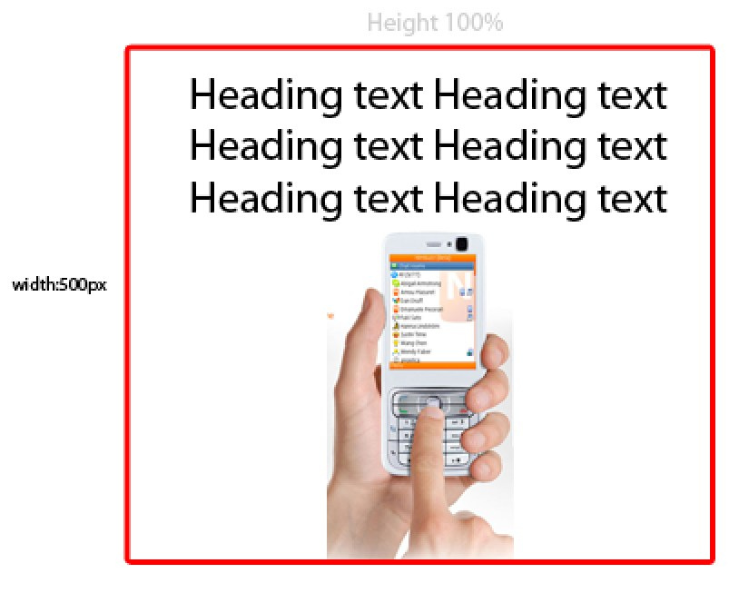
#main {width:950px; height:100%; background:url(image.jpg) no-repeat center bottom}
When browser resize images should no to go under the text, images should shrink the size to keep the same position and distance
@jitendra; Yes you can use
background-sizeproperty for this but instead ofcovergive value in100%like thisCSS:
may be that's work for you
read these article for more: http://webdesign.about.com/od/styleproperties/p/blspbgsize.htm , http://robertnyman.com/css3/background-size/background-size.html
This is how i would do it.
http://jsfiddle.net/DpneL/1/
HTML:
CSS:
I'd suggest using this jQuery plugin http://johnpatrickgiven.com/jquery/background-resize/
You can use the css
background-size. Have a look here: w3c background-sizeYou are probably after
containorcover.Alternatively, here is an example with an img tag: http://jsfiddle.net/jwg2s/ Try resizing your browser.
HTML
CSS
Proportionally it is not going to be right as you are setting a specific width with a percentage height. So try setting a width and height in according percentages.
If you are using height 100% then it's always going to go under your text as well, so that would explain that as it'll go to 100% of the browser.
You may need to experiment with setting width and height as values such as 80% etc. experiment!