I'm having difficulty getting the GUI layout results I want in an Android app.
A brief description of what I want:
The GUI is to include two TextViews and four Buttons.
The four Buttons are to be laid out horizontally, all in the same row, and fixed at the bottom-right of the screen.
The first of the two TextViews is to start at the top of the screen, with text contents varying from one line to many dozens of lines - more than will fit on the screen without scrolling. So, scrolling is sometimes necessary to see all of the contents. Even when scrolling is necessary, the buttons are not to participate in the scrolling: they are to always remain fixed in a single row at the bottom-right of the screen. When scrolling is necessary, the scrolling text is to always be above the buttons - the buttons are not to overlay the text.
The second of the two TextViews is to appear immediately beneath the first TextView, and will normally only add one or two lines to the total length of text. When scrolling is necessary, the second TextView is to scroll with the first TextView, always appearing immediately beneath the first TextView.
Additional constraints include that I want the layout to look decent on all of the following Android devices, in both vertical and horizontal screen layouts:
- Android 1.5 API3 QVGA MDPI (320x240) devices
- Android 1.5 API3 HVGA MDPI devices
- Android 1.6 API4 QVGA LDPI devices
- Android 2.3 API10 WVGA800 devices
- Everything with screens in between the above devices
I'll worry about tablets another day (like tomorrow).
--
I've tried many different combinations of Layouts, but nothing yet has come very close to the goal.
(With some of the layout combinations I tried, I can fix the buttons at the bottom-left of the screen with RelativeLayout, but everything I try with the scolling text always results with the text scrolling behind the buttons - the buttons overlay the text. I haven't figured out getting the buttons to align to the bottom-right.)
If anyone is up for helping me figure this out, the layout example xml below is a conversation starting point, but it definately fails to achieve the goal result, as demonstrated in the following screen shots, generated using this same layout example xml. (While some of the screen shots demonstrate the same problem, they help to show where I'm at with the different screens.)
<?xml version="1.0" encoding="utf-8"?>
<LinearLayout
    xmlns:android="http://schemas.android.com/apk/res/android"
    android:orientation="vertical"
    android:layout_width="fill_parent"
    android:layout_height="wrap_content">
    <ScrollView
        android:layout_width="fill_parent"
        android:layout_height="wrap_content">
        <LinearLayout
            android:orientation="vertical"
            android:layout_width="fill_parent"
            android:layout_height="wrap_content">
            <TextView
                android:layout_width="fill_parent"
                android:layout_height="wrap_content"
                android:text="Text View 1.  Text varies from a few lines to many more lines than what fits on the screen.  Scrolling is necessary to see it all." />
            <TextView
                android:layout_width="fill_parent"
                android:layout_height="wrap_content"
                android:text="Text View 2.  Short text entry sits below Text View 1." />
        </LinearLayout>
    </ScrollView>
    <LinearLayout
        android:orientation="horizontal"
        android:layout_width="fill_parent"
        android:layout_height="wrap_content">
        <Button
            android:id="@+id/button_1"
            android:layout_height="fill_parent"
            android:layout_width="wrap_content"
            android:text="Button 1" />
        <Button
            android:id="@+id/button_2"
            android:layout_height="fill_parent"
            android:layout_width="wrap_content"
            android:text="Button 2" />
        <Button
            android:id="@+id/button_3"
            android:layout_height="fill_parent"
            android:layout_width="wrap_content"
            android:text="Button 3" />
        <Button
            android:id="@+id/button_4"
            android:layout_height="fill_parent"
            android:layout_width="wrap_content"
            android:text="Button 4" />
    </LinearLayout>
</LinearLayout>
1.5_API3_HVGA_Horizontal_MDPI - short_text:
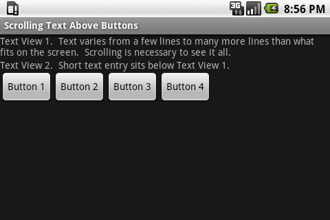
Issue: The buttons should align with the bottom-right of the screen.
--
1.5_API3_HVGA_Vertical_MDPI - short_text:
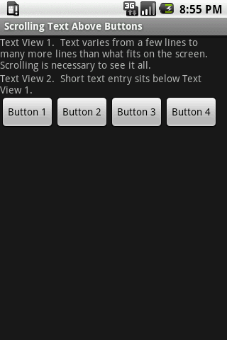
Issue: The buttons should align with the bottom-right of the screen.
--
1.5_API3_QVGA_240x320_MDPI - short_text:
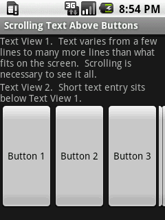
Issue: 4th Button is smashed. Prefer text on first three buttons to wrap when necessary, leaving enough room to display 4th button.
--
1.5_API3_QVGA_320x240_MDPI - short_text:
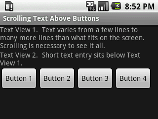
Issue: The buttons should align with the bottom-right of the screen.
--
1.6_API4_QVGA_Horizontal_LDPI - long_text:
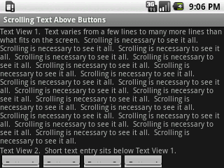
Issue: When the text almost fills the screen, the row of buttons get smashed. The row of buttons should not be smashed, and should be fixed at the bottom-right of the screen. The text should scroll above the buttons.
--
1.6_API4_QVGA_Horizontal_LDPI - short_text:
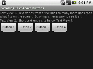
Issue: The buttons should align with the bottom-right of the screen.
--
1.6_API4_QVGA_Horizontal_LDPI - very_long_text, scrollbar at top:
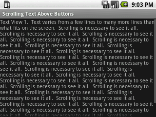
Issue: The buttons are not on the screen. They should be fixed at the bottom-right of the screen.
--
1.6_API4_QVGA_Horizontal_LDPI - very_long_text, scrollbar at bottom:
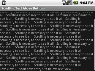
Issue: The buttons are no where to be found, though the text scrollbar is at the bottom. They should be fixed at the bottom-right of the screen.
--
1.6_API4_QVGA_Vertical_LDPI - short_text:
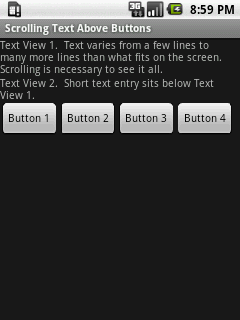
Issue: The buttons should align with the bottom-right of the screen.
--
Any advice?
--
Additional Info: When I try to use RelativeLayout, and fix the buttons at the bottom of the screen with android:layout_alignParentBottom="true", then my problem is that I don't know how to fix the bottom of the scroll view with the top of the buttons. Using android:layout_alignBottom="@id/buttons" just aligns the bottom of the scroll view with the bottom of the buttons, but then the buttons overlay the text, like this:
--
Update: The problem of fixing the buttons to the bottom-right, with the scrolling text above the buttons is resolved.
Here's the changed layout XML that works so far (paste more text into text view 1 if you want to see the scrolling):
<?xml version="1.0" encoding="utf-8"?>
<LinearLayout
    xmlns:android="http://schemas.android.com/apk/res/android"
    android:orientation="vertical"
    android:layout_width="fill_parent"
    android:layout_height="fill_parent">
    <ScrollView
        android:layout_width="fill_parent"
        android:layout_height="0dp"
        android:layout_weight="1">
        <LinearLayout
            android:orientation="vertical"
            android:layout_width="fill_parent"
            android:layout_height="wrap_content">
            <TextView
                android:layout_width="fill_parent"
                android:layout_height="wrap_content"
                android:text="Text View 1.  Text varies from a few lines to many more lines than what fits on the screen.  Scrolling is necessary to see it all." />
            <TextView
                android:layout_width="fill_parent"
                android:layout_height="wrap_content"
                android:text="Text View 2.  Short text entry sits below Text View 1." />
        </LinearLayout>
    </ScrollView>
    <LinearLayout
        android:orientation="horizontal"
        android:layout_width="fill_parent"
        android:layout_height="wrap_content"
        android:gravity="right">
        <Button
            android:id="@+id/button_1"
            android:layout_height="fill_parent"
            android:layout_width="wrap_content"
            android:text="Button 1" />
        <Button
            android:id="@+id/button_2"
            android:layout_height="fill_parent"
            android:layout_width="wrap_content"
            android:text="Button 2" />
        <Button
            android:id="@+id/button_3"
            android:layout_height="fill_parent"
            android:layout_width="wrap_content"
            android:text="Button 3" />
        <Button
            android:id="@+id/button_4"
            android:layout_height="fill_parent"
            android:layout_width="wrap_content"
            android:text="Button 4" />
    </LinearLayout>
</LinearLayout>
Change the layout used to a RelativeLayout, this will help you attach your buttons accross the bottom of the screen.
I also agree with the use of the layout_height="0dip" and layout_weight="1" on the scrollable that can be of varrying length.
EDIT
I just changed the code to this and it worked fine for me on my HTC Desire. It should hopefully work on your test cases. Ended up just using a linear layout, but it seems fine.
Set your ScrollView's layout_height to 0dp and set its layout_weight to 1. That should push the buttons to the bottom of the screen but no further.