CSS text justify with letter spacing

2019-01-14 11:27发布

Is there a way to automatically justify words using letter spacing, each in its row, to a defined width, using CSS?

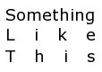
For example, "Something like this" would look, well, something like this:

"Something like this" would look something like this

Is there a non-obtrusive way to apply such styling to my text? I believe pure CSS doesn't have this option (at least not with CSS versions before 3, CSS3 seems to have a text-justify property, but it's not well supported yet), so js solutions would be fine also.

9条回答
该账号已被封号
2楼-- · 2019-01-14 11:40

Here is an other aproach using a jQuery snippet I wrote for this question : Stretch text to fit width of div :

DEMO

HTML :

<div class="stretch">Something</div>
<div class="stretch">Like</div>
<div class="stretch">This</div>

jQuery :

$.fn.strech_text = function () {
    var elmt = $(this),
        cont_width = elmt.width(),
        txt = elmt.html(),
        one_line = $('<span class="stretch_it">' + txt + '</span>'),
        nb_char = elmt.text().length,
        spacing = cont_width / nb_char,
        txt_width;

    elmt.html(one_line);
    txt_width = one_line.width();

    if (txt_width < cont_width) {
        var char_width = txt_width / nb_char,
            ltr_spacing = spacing - char_width + (spacing - char_width) / nb_char;

        one_line.css({
            'letter-spacing': ltr_spacing
        });
    } else {
        one_line.contents().unwrap();
        elmt.addClass('justify');
    }
};


$(document).ready(function () {
    $('.stretch').each(function () {
        $(this).strech_text();
    });
});
查看更多
仙女界的扛把子
3楼-- · 2019-01-14 11:45

Needed this too, so I've bundled the suggested technique in a simple to use jquery-plugin you can find here: https://github.com/marc-portier/jquery-letterjustify#readme.

It uses the same procedure at its core, and adds some options to tweak. Comments welcome.

查看更多
做个烂人
4楼-- · 2019-01-14 11:48

I just made a JQuery script from table's Tony B approach. Here is the JSFiddle https://jsfiddle.net/7tvuzkg3/7/

This script creates a table with each char in a row. This works with full sentence. I'm not sure this is fully optimized.

justifyLetterSpacing("sentence");

function justifyLetterSpacing(divId) {

	// target element
	domWrapper = $('#' + divId).clone().html('');
	// construct <td>
	$('#' + divId).contents().each(function(index){
      // store div id to td child elements class
	  var tdClass = divId ;
      // split text 
	  $textArray = $(this).text().split('');
      // insert each letters in a <td>
	  for (var i = 0; i < $textArray.length; i++) {
        // if it's a 'space', replace him by an 'html space'
        if( $textArray[i] == " " )  {
            $('<td>')
                .addClass(tdClass)
                .html("&nbsp;&nbsp;")
                .appendTo(domWrapper);
        }// if it's a char, add it
        else{  
            $('<td>')
                .addClass(tdClass)
                .text($textArray[i])
                .appendTo(domWrapper);
        }
	  }
	});
    // create table
    table = 
    $( "<table id='"+divId+"'/>" ).append( 
        $( "<tbody>" ).append( 
            $( "<tr>" ).append( 
                ( domWrapper ).children('td') 
            ) 
        )
    );
    // replace original div
	$('#' + divId).replaceWith( table );
}	
#sentence {
  width : 100%;
  background-color : #000;
  color : #fff;
  padding : 1rem;
}
<script src="https://ajax.googleapis.com/ajax/libs/jquery/2.1.1/jquery.min.js"></script>
<div id="sentence">LOREM IPSUM DOLOR</div>

查看更多
淡お忘
5楼-- · 2019-01-14 11:56

Again, I know this is REALLY old, but why not just put a space between each letter and then text-align:justify? Then each letter would be regarded as a 'word' and justified accordingly

查看更多
来,给爷笑一个
6楼-- · 2019-01-14 12:00

Here's a script which can do it. It isn't pretty, but maybe you can hack it to meet your needs. (Updated to handle resizing)

<html>
<head>
<style>
#character_justify {
    position: relative;
    width: 40%;
    border: 1px solid red;
    font-size: 32pt;
    margin: 0;
    padding: 0;
}
#character_justify * {
    margin: 0;
    padding: 0;
    border: none;
}
</style>
<script>
function SplitText(node)
{
    var text = node.nodeValue.replace(/^\s*|\s(?=\s)|\s*$/g, "");

    for(var i = 0; i < text.length; i++)
    {
        var letter = document.createElement("span");
        letter.style.display = "inline-block";
        letter.style.position = "absolute";
        letter.appendChild(document.createTextNode(text.charAt(i)));
        node.parentNode.insertBefore(letter, node);

        var positionRatio = i / (text.length - 1);
        var textWidth = letter.clientWidth;

        var indent = 100 * positionRatio;
        var offset = -textWidth * positionRatio;
        letter.style.left = indent + "%";
        letter.style.marginLeft = offset + "px";

        //console.log("Letter ", text[i], ", Index ", i, ", Width ", textWidth, ", Indent ", indent, ", Offset ", offset);
    }

    node.parentNode.removeChild(node);
}

function Justify()
{
    var TEXT_NODE = 3;
    var elem = document.getElementById("character_justify");
    elem = elem.firstChild;

    while(elem)
    {
        var nextElem = elem.nextSibling;

        if(elem.nodeType == TEXT_NODE)
            SplitText(elem);

        elem = nextElem;
    }
}

</script>
</head>
<body onload="Justify()">
<p id="character_justify">
Something<br/>
Like<br/>
This
</p>
</body>
查看更多
可以哭但决不认输i
7楼-- · 2019-01-14 12:02

An alternate way to handle this might be to use the "vw" sizing unit. This unit type can be used in font size properties and represents a percent of the window's width.

Disclaimer: It is not exactly what you are looking for, but requires no scripting. It does adjust the text size, but will also scale to the width of your page.

For example,

.heading {
  font-size: 4vw;
}

will make the width of one character in the current font 4% of the window width.

You could then use media queries if you wish to lock the font size to a minimum size based on the window's width.

@media only screen and (max-width: 768px) {
    font-size: 2rem;
}

Use the browser inspector to play with the font-size property and tweak the value to what makes sense for your application.

The "vw" unit works in IE9+, iOS 8.3+ and Android 4.4+ and all other mainstream browsers. I wouldn't worry about the mobile support too much, as you can use media queries to put the right sizing for these devices as described above.

http://caniuse.com/#feat=viewport-units

https://css-tricks.com/viewport-sized-typography/

Viewport units are a powerful way to scale many different aspects of your site with little code.

查看更多
登录 后发表回答