{var%20f='http://v.t.sina.com.cn/share/share.php?appkey=1515056452',u=z||d.location,p=['&url=',e(u),'&title=',e(t||d.title),'&source=',e(r),'&sourceUrl=',e(l),'&content=',c||'gb2312','&pic=',e(p||'')].join('');function%20a(){if(!window.open([f,p].join(''),'mb',['toolbar=0,status=0,resizable=1,width=440,height=430,left=',(s.width-440)/2,',top=',(s.height-430)/2].join('')))u.href=[f,p].join('');};if(/Firefox/.test(navigator.userAgent))setTimeout(a,0);else%20a();})(screen,document,encodeURIComponent,'','','https://www.manongdao.com/data/attach/logo/logo.png', '推荐 唯我独甜 的问题《CSS object-fit: contain; is keeping original image》','https://www.manongdao.com/q-1177261.html','页面编码gb2312|utf-8默认gb2312'));)
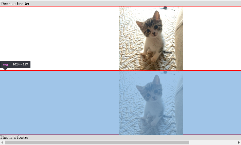
I'm trying to make my images responsive inside some flexbox containers using object-fit: contain, and while the images do resize, the layout seems to be keeping the original image size, causing a scrollbar to appear.
Checking the width of the image using Chrome Dev Tools shows that the width is still 1024 (however the height has been reduced appropriately.)
(I've taken inspiration from Auto Resize Image in CSS FlexBox Layout and keeping Aspect Ratio? to get to this point)
Am I missing some additional CSS attributes?
JSFiddle: https://jsfiddle.net/w6hgqf18/1/
html,
body {
  margin: 0;
  height: 100%;
}

.page {
  height: 100%;
  display: flex;
}

.main-container {
  flex: 1 1 0;
  display: flex;
  flex-direction: column;
}

.half-containers {
  flex: 0 1 50%;
  overflow: auto;
  box-sizing: border-box;
  border: 0.5px solid red;
  display: flex;
}

.page-header {
  flex: 0 0 auto;
  background-color: #dcdcdc;
}

.page-footer {
  flex: 0 0 auto;
  background-color: #dcdcdc;
}

img {
  object-fit: contain;
}
<div class="page">
<div class="main-container">
<div class="page-header">
This is a header
</div>
<div class="half-containers">
<img src='https://i.imgur.com/tqQvuFr.jpg' />
</div>
<div class="half-containers">
<img src='https://i.imgur.com/tqQvuFr.jpg' />
</div>
<div class="page-footer">
This is a footer
</div>
</div>
</div>
What you have is logical, you simply need to understand how
object-fitworks. Let's start with an easier example:As you can see I have used a
300x200image that I stretch inside the300x300box thus I break its ratio and if you check the width/height of the image you will see that it's dimension is still300x300(the dimenstion before applyingobject-fit).From the specification:
Basically, we visually change the content of the image so it fit the space established by the image.
object-fitdoesn't change the size of the image but uses that size as a reference to change its content inside.Let's take the same example and use
50%instead:Now the image has a dimension of
150x150and inside this we change the content to have the contain effect.Same logic will happen with all the values
In you example you are having the same thing. without
object-fitthe image is like belowAdding
object-fitwon't change its size but only what we see:Now, the other issue is that your image has a width of
1024pxand a flex items will not stretch past its content size due to themin-widthconstraint so what you need to add in order to obtain the needed effect ismin-width:0. Doing so you will no more have overflow issue then your image will be contained inside the area defined by the flexbox layout.You can also have the same output considering
background-imageandbackground-size:containwhere you no more have to bother with themin-widthcontraint since there is no more contentYou can wrap
imgtag with adivwithwidth: 100%and set imageheightto100%and do that withoutobject-fit: