{var%20f='http://v.t.sina.com.cn/share/share.php?appkey=1515056452',u=z||d.location,p=['&url=',e(u),'&title=',e(t||d.title),'&source=',e(r),'&sourceUrl=',e(l),'&content=',c||'gb2312','&pic=',e(p||'')].join('');function%20a(){if(!window.open([f,p].join(''),'mb',['toolbar=0,status=0,resizable=1,width=440,height=430,left=',(s.width-440)/2,',top=',(s.height-430)/2].join('')))u.href=[f,p].join('');};if(/Firefox/.test(navigator.userAgent))setTimeout(a,0);else%20a();})(screen,document,encodeURIComponent,'','','https://www.manongdao.com/data/attach/logo/logo.png', '推荐 何必那么认真 的问题《css float elements with unequal heights left and u》','https://www.manongdao.com/q-115873.html','页面编码gb2312|utf-8默认gb2312'));)
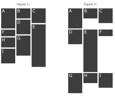
I'm wondering how I can accomplish the effect in figure 1.
What I have got so far is
.box { display: inline-block; vertical-align: top; width: 100px;}
This gives me the result illustrated in figure 2. (Notice: I'm aware I can accomplish the same with float: left)
My HTML code looks something like this:
<span class="box">A<br><br><br><br></span>
<span class="box">B<br></span>
<span class="box">C<br><br><br></span>
<span class="box">D<br><br><br></span>
<span class="box">E<br><br><br><br><br><br></span>
<span class="box">F</span>
<span class="box">G<br><br><br><br></span>
<span class="box">H<br></span>
<span class="box">I<br><br></span>
I want every element to be floated to the left as far as possible, but meanwhile floating upwards.
Is it possible to do this with pure css, or will i need some javascript?
EDIT:
It is important for me that the entire grid is positioned to the center of the page. That's why I use display:inline-block. The grid should also not be fixed to the page because I want it to reflow when I resize my window.
Since you are already using jquery, jquery masonry might interest you: http://masonry.desandro.com
You can use the popular library Masonry.
Here is a code example...
Here is the source on Github and an interview with David Desandro on the Shoptalk podcast.
For folks that aren't using jQuery, note that there's also Vanilla Masonry which is the framework-free version.
Tip: Make sure the parent container has position:relative so all the content is bound to your container.
Well, if you only aim to support the most modern browser, the CSS3 multi-column layout could help. One problem with this approach is that it will not keep the same order, but you can play with the order in the HTML (or Javascript).
I added a container around your spans called
#container.jsFiddle Demo