{var%20f='http://v.t.sina.com.cn/share/share.php?appkey=1515056452',u=z||d.location,p=['&url=',e(u),'&title=',e(t||d.title),'&source=',e(r),'&sourceUrl=',e(l),'&content=',c||'gb2312','&pic=',e(p||'')].join('');function%20a(){if(!window.open([f,p].join(''),'mb',['toolbar=0,status=0,resizable=1,width=440,height=430,left=',(s.width-440)/2,',top=',(s.height-430)/2].join('')))u.href=[f,p].join('');};if(/Firefox/.test(navigator.userAgent))setTimeout(a,0);else%20a();})(screen,document,encodeURIComponent,'','','https://www.manongdao.com/data/attach/logo/logo.png', '推荐 我只想做你的唯一 的问题《Multi-coloured circular div using background colou》','https://www.manongdao.com/q-111459.html','页面编码gb2312|utf-8默认gb2312'));)
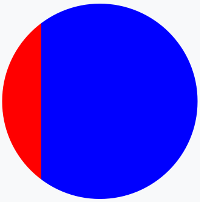
I'm trying to create a multi-coloured circle in CSS to simulate a wheel of fortune, I've tried using linear gradients but it just applies strips of colour running vertically through the circular div rather than being coloured areas as if you were cutting up a pizza if that makes sense?
This is the code I've tried:
background: -moz-linear-gradient(left, red, red 20%, blue 20%, blue);
Which results in:
But I want it to look more like this?:
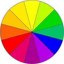
Is this possible in CSS or am I going to have to use a background image (I'd rather avoid this because it isn't as easy to scale as the page resizes etc..)?
It can be done using something called conic gradients. Unfortunately, they're not supported by many browsers right now. Lea Verou created a lightweight JS plugin though that can enable their usage:
https://leaverou.github.io/conic-gradient/
This could be used to create: