{var%20f='http://v.t.sina.com.cn/share/share.php?appkey=1515056452',u=z||d.location,p=['&url=',e(u),'&title=',e(t||d.title),'&source=',e(r),'&sourceUrl=',e(l),'&content=',c||'gb2312','&pic=',e(p||'')].join('');function%20a(){if(!window.open([f,p].join(''),'mb',['toolbar=0,status=0,resizable=1,width=440,height=430,left=',(s.width-440)/2,',top=',(s.height-430)/2].join('')))u.href=[f,p].join('');};if(/Firefox/.test(navigator.userAgent))setTimeout(a,0);else%20a();})(screen,document,encodeURIComponent,'','','https://www.manongdao.com/data/attach/logo/logo.png', '推荐 我只想做你的唯一 的问题《Multi-coloured circular div using background colou》','https://www.manongdao.com/q-111459.html','页面编码gb2312|utf-8默认gb2312'));)
I'm trying to create a multi-coloured circle in CSS to simulate a wheel of fortune, I've tried using linear gradients but it just applies strips of colour running vertically through the circular div rather than being coloured areas as if you were cutting up a pizza if that makes sense?
This is the code I've tried:
background: -moz-linear-gradient(left, red, red 20%, blue 20%, blue);
Which results in:
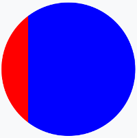
But I want it to look more like this?:
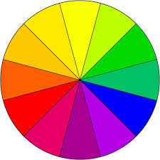
Is this possible in CSS or am I going to have to use a background image (I'd rather avoid this because it isn't as easy to scale as the page resizes etc..)?
You can make this with using borders:
UPDATE 1
Extending on the answer of @Temani Afif, but more similar to your request:
There you have it: a reliable way to create multi-color circles. The great thing about this approach is that it doesn’t matter how many colors you have AND it works all the way back to IE.
You could achieve this with css, but as you want 12 slices you will have to use a more complicated markup. If you only want to use 4 or 8, a much simpler solution using a multiple background would be possible.
Another idea which I would prefer: Use a svg graphic for it.
CSS Tricks has a post about conic gradients that describes the "colorful umbrella" as an intermediate step, which looks perfect for your use. I've put it together into a Code Pen for convenience.
HTML:
SCSS:
As a side note, if your only issue with background images is the scaling issue, keep in mind that SVG images scale smoothly, since they're basically vector graphics. (You'd have to draw that manually, but the image would scale.)
A solution to have something is to use multiple background layer considering rotated linear-gradient. We can also rely on pseudo-element and some transparent colors.
Then simply adjust the degrees, colors, opacity of colors and position of pseudo element to obtain any chart you want:
Here is more example considering different configuration
background-positionlike the answer of @vals) :