{var%20f='http://v.t.sina.com.cn/share/share.php?appkey=1515056452',u=z||d.location,p=['&url=',e(u),'&title=',e(t||d.title),'&source=',e(r),'&sourceUrl=',e(l),'&content=',c||'gb2312','&pic=',e(p||'')].join('');function%20a(){if(!window.open([f,p].join(''),'mb',['toolbar=0,status=0,resizable=1,width=440,height=430,left=',(s.width-440)/2,',top=',(s.height-430)/2].join('')))u.href=[f,p].join('');};if(/Firefox/.test(navigator.userAgent))setTimeout(a,0);else%20a();})(screen,document,encodeURIComponent,'','','https://www.manongdao.com/data/attach/logo/logo.png', '推荐 淡お忘 的问题《One popup for all button》','https://www.manongdao.com/q-1092529.html','页面编码gb2312|utf-8默认gb2312'));)
As topic mentioned.I want to use only one popup for all button in my application.I don't know how to get what I want. Here is what my window looks like:
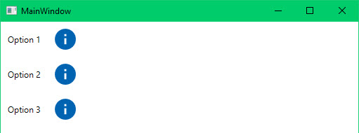
Info 1:
Info 2:

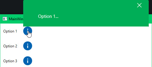
You can see popup appear on wrong position.I know I can position a popup by setting the PlacementTarget.But each Popup has a different value for the placement property.That is the problem.I'm looking another way to do it.
Here is a popup for option 1:
<StackPanel Orientation="Horizontal">
 <!--Option 1: text and button-->
 <TextBlock Text="Option 1"
  Margin="10"
  VerticalAlignment="Center" />
 <Popup x:Name="popInfo"
   PlacementTarget="{Binding ElementName=btnInfoOption1}"
   IsOpen="{Binding IsShowInfo1}">
    <ContentControl Style="{StaticResource ContentInfoStyle}">
     <TextBlock Text="{Binding InfoContent}"
      TextWrapping="Wrap"
      Foreground="White"
      Width="340"
      Padding="10"
      Margin="30,0,30,5"
      FontSize="15" />
    </ContentControl>
 </Popup>

 <Button x:Name="btnInfoOption1"
   Style="{StaticResource btnIcons}"
   Background="#0063b1"
   Width="30"
   Height="30"
   Margin="10,10,20,10"
   Command="{Binding CmdShowInfo, Delay=1500}"
   Tag="{StaticResource ic_ginfo}" />
</StackPanel>
popup for option 2:
<StackPanel Orientation="Horizontal">
 <!--Option 2: text and button-->
 <TextBlock Text="Option 2"
  Margin="10"
  VerticalAlignment="Center" />
  <Button x:Name="btnOption2"
   Style="{StaticResource btnIcons}"
   Background="#0063b1"
   Width="30"
   Height="30"
   Margin="10,10,20,10"
   Command="{Binding CmdShowInfo, Delay=1500}"
   Tag="{StaticResource ic_ginfo}" />
</StackPanel>
ContentControl Style:
<Style TargetType="{x:Type ContentControl}"
 x:Key="ContentInfoStyle">
 <Setter Property="ContentTemplate">
  <Setter.Value>
   <DataTemplate>
     <Border Background="Green"
      CornerRadius="3"
      Padding="10,0,12,10">
     <StackPanel>
      <Button HorizontalAlignment="Right"
       Tag="{StaticResource ic_gclear}"
       Style="{StaticResource btnIcons}"
       Background="White"
       Margin="10,5,12,5"
       Command="{Binding DataContext.CmdCloseInfo}"
       Height="24" />
        <ContentPresenter x:Name="content"
          TextBlock.FontSize="14"
          TextBlock.Foreground="White"
          TextBlock.FontFamily="Arial"
          Content="{TemplateBinding ContentControl.Content}" />
    </StackPanel>
    </Border>
   </DataTemplate>
   </Setter.Value>
  </Setter>
</Style>
Button icon style:
<Style TargetType="Button"
  x:Key="btnIcons">
  <Setter Property="Template">
  <Setter.Value>
    <ControlTemplate TargetType="{x:Type Button}">
      <Border x:Name="brd" Background="Transparent"
       SnapsToDevicePixels="True">
       <VisualStateManager.VisualStateGroups>
        <VisualStateGroup x:Name="CommonStates">
         <VisualState x:Name="Normal" />
         <VisualState x:Name="MouseOver" />
         <VisualState x:Name="Pressed" />
        </VisualStateGroup>
       </VisualStateManager.VisualStateGroups>
       <Path Stretch="Uniform" VerticalAlignment="Center"
        Fill="{TemplateBinding Background}"
        Data="{TemplateBinding Tag}" />
      </Border>
    </ControlTemplate>
  </Setter.Value>
  </Setter>
</Style>
ViewModel.cs: the content of popup:
private string _InfoContent;

public string InfoContent
{
  get { return _InfoContent; }
  set
  {
    if (value != _InfoContent)
    {
      _InfoContent = value;
      OnRaise("InfoContent");
    }
  }
}
show the popup for option2 and option1:
private bool _IsShowInfo2;

public bool IsShowInfo2
{
  get { return _IsShowInfo2; }
  set
  {
    if (value != _IsShowInfo2)
    {
      _IsShowInfo2 = value;
      OnRaise("IsShowInfo2");
    }
  }
}
//show the popup for option1
private bool _IsShowInfo1;

public bool IsShowInfo1
{
  get { return _IsShowInfo1; }
  set
  {
    if (value != _IsShowInfo1)
    {
      _IsShowInfo1 = value;
      OnRaise("IsShowInfo1");
    }
  }
}
the command for button:
private ICommand _CmdShowInfo;

public ICommand CmdShowInfo
{
  get
  {
    _CmdShowInfo = _CmdShowInfo ?? new RelayCommand(x => this.ShowInfo(true, 1), () => true);
    return _CmdShowInfo;
  }
}

private ICommand _CmdShowInfo2;

public ICommand CmdShowInfo2
{
  get
  {
    _CmdShowInfo2 = _CmdShowInfo2 ?? new RelayCommand(x => this.ShowInfo(true, 0), () => true);
    return _CmdShowInfo2;
  }
}

private void ShowInfo(bool show = true, byte option = 0)
{
  if (option == 0)
  {
    this.InfoContent = "Option 1...";
  }
  else if (option == 1)
  {
    this.InfoContent = "Option 2...";
  }
  this.IsShowInfo1 = show;
}
My initial thought was to do this with a styled
HeaderedContentControl, but then you've got the icon fill color and the icon data, and I'd have had to add attached properties for those. Once you go there, you may as well just write a custom control.The dependency properties of
IconPopupButtoncan be bound like any dependency property:If you want to parameterize the
Styleapplied to theContentControlin thePopup, add another dependency property. You'll need to give that some thought, though, because you need thatToggleButtonto be bound toIsOpenon the templated parent, one way or another. Perhaps you could bind it to the viewmodel property that's bound to the popup button'sIsOpen. There's always a way.So here's that. With snippets to create dependency properties, this is pretty much just a fill-in-the-blanks exercise. Much less to it than meets the eye.
IconPopupButton.cs
Themes\Shared.xaml
Themes\Generic.xaml
MainWindow.xaml example usage:
You'll notice I changed your buttons to
ToggleButton. This is for convenience in wiring them up to theIsOpenproperty: With aToggleButton, I just bindIsCheckedand I'm done. No need for commands. One side effect of that is that ifStaysOpenisfalse, then when the user clicks on the open button for aPopup, the focus change closes thePopup, which unchecks the button, and then the button gets the mouse message. So the button opens the popup again. This is bizarre behavior from the user's perspective, so you add a trigger to disable the button when the popup is open andStaysOpenis false. WhenStaysOpenis true, focus change doesn't close thePopup, so you want the button to be enabled in that case.I changed the
btnIconsstyle to targetButtonBase, so it works identically withButtonandToggleButton.