{var%20f='http://v.t.sina.com.cn/share/share.php?appkey=1515056452',u=z||d.location,p=['&url=',e(u),'&title=',e(t||d.title),'&source=',e(r),'&sourceUrl=',e(l),'&content=',c||'gb2312','&pic=',e(p||'')].join('');function%20a(){if(!window.open([f,p].join(''),'mb',['toolbar=0,status=0,resizable=1,width=440,height=430,left=',(s.width-440)/2,',top=',(s.height-430)/2].join('')))u.href=[f,p].join('');};if(/Firefox/.test(navigator.userAgent))setTimeout(a,0);else%20a();})(screen,document,encodeURIComponent,'','','https://www.manongdao.com/data/attach/logo/logo.png', '推荐 一纸荒年 Trace。 的问题《Svg masks / clipping path woes》','https://www.manongdao.com/q-1052569.html','页面编码gb2312|utf-8默认gb2312'));)
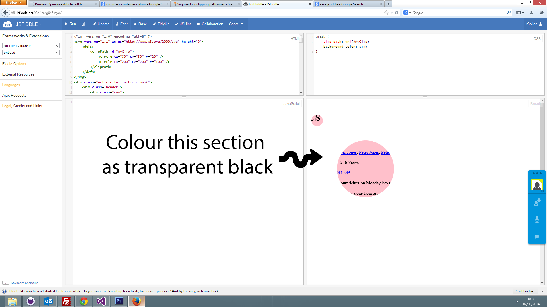
here is a fiddle to show my current working of svg:
http://jsfiddle.net/r3plica/g046qfyq/
As you can see, I have added two circles which are masking the content behind. The mask is working as I want, but! I would like to change the background of the all of it to rgba(0,0,0,0.5).
At the moment I added:
background-color: pink;
this is applied to the .mask class and has colored in the circles. What I want to do is colour in everything but the circles.
Here is an image explaining what I mean.
If anyone can help me with this, that would be super :)
Update 1
I am trying to create this:

I have this fiddle now:
http://jsfiddle.net/r3plica/g046qfyq/2/
If I could invert the clipping path, that would be the solution. Is there anyway to do this?
Cheers.
Just change your svg
clippathto amask, add a white rectangle to cover all your area and set the circles in black.and use it with the
maskcss property.`you can improve it a bit by placing both the mask and the content in a container with
position:relativeand then addingposition:absoluteto your.modalclass.Just wrap everything with div and apply
rgba(0, 0, 0, 0.5)as background-color. http://jsfiddle.net/Justinas_Jurciukonis/g046qfyq/3/EDIT
Why not just use overlay with dark background color and css image of rectangle with hole inside of it? Than just use background-position to move that circle in page.