{var%20f='http://v.t.sina.com.cn/share/share.php?appkey=1515056452',u=z||d.location,p=['&url=',e(u),'&title=',e(t||d.title),'&source=',e(r),'&sourceUrl=',e(l),'&content=',c||'gb2312','&pic=',e(p||'')].join('');function%20a(){if(!window.open([f,p].join(''),'mb',['toolbar=0,status=0,resizable=1,width=440,height=430,left=',(s.width-440)/2,',top=',(s.height-430)/2].join('')))u.href=[f,p].join('');};if(/Firefox/.test(navigator.userAgent))setTimeout(a,0);else%20a();})(screen,document,encodeURIComponent,'','','https://www.manongdao.com/data/attach/logo/logo.png', '推荐 叛逆 的问题《CSS transform 3d cube offsets》','https://www.manongdao.com/q-1052220.html','页面编码gb2312|utf-8默认gb2312'));)
I am trying to use CSS 3D transforms to display cubes and cuboids which will contain cross-sections. I am targeting Chrome, Firefox and MSIE 11. I have found that to maintain MSIE 11 compatibility, I need to avoid using transform-type: preserve-3d, as this is not supported by Microsoft, so I need to apply all parent and child transforms to each cube face.
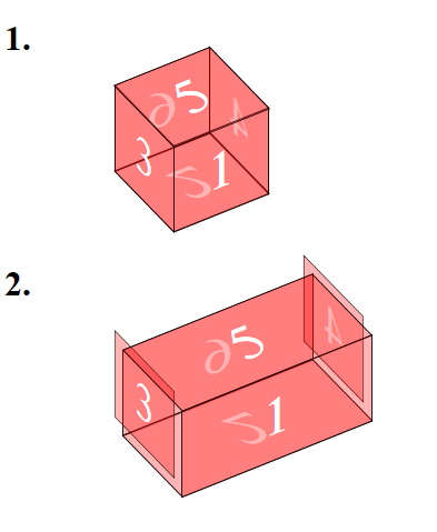
For a cube, I can rotate each side to align them correctly, but for a cuboid, the ends are offset - why is this, and how can I fix it?
This screenshot illustrates the problem:
Here is the HTML:
<div class="test test1">
    <h1>1.</h1>
    <div class="cube">
        <div class="side front">1</div>
        <div class="side back">6</div>
        <div class="side right">4</div>
        <div class="side left">3</div>
        <div class="side top">5</div>
        <div class="side bottom">2</div>
    </div>
</div>

<div class="test test2">
    <h1>2.</h1>
    <div class="cube cuboid">
        <div class="side front">1</div>
        <div class="side back">6</div>
        <div class="side right">4</div>
        <div class="side left">3</div>
        <div class="side top">5</div>
        <div class="side bottom">2</div>
    </div>
</div>
and here is the CSS:
    div.test {
        height: 200px;
    }

    /* basic cube */
    .cube {
        font-size: 4em;
        width: 500px;
        margin: auto;
        /* MSIE11 does not support preserve-3d.
          for MSIE all transforms must be applied to all elements */
    }

    .side {
        position: absolute;
        width: 100px;
        height: 100px;
        background: rgba(255,0,0,0.3);
        border: 1px solid black;
        color: white;
        text-align: center;
        line-height: 100px;
    }
    /* for MSIE11 compatibility, avoid using a transform on the parent, combine all parent+child transforms, transform-style: preserve3d is not supported */
    .front {
        transform: rotateX(-40deg) rotateY(32deg) translateZ(50px);
        z-index: 1000;
    }
    .top {
        transform: rotateX(-40deg) rotateY(32deg) rotateX(90deg) translateZ(50px);
        z-index: 1000;
    }
    .right {
        transform: rotateX(-40deg) rotateY(32deg) rotateY(90deg) translateZ(50px);
    }
    .left {
        transform: rotateX(-40deg) rotateY(32deg) rotateY(-90deg) translateZ(50px);
        z-index: 1000;
    }
    .bottom {
        transform: rotateX(-40deg) rotateY(32deg) rotateX(-90deg) translateZ(50px);
    }
    .back {
        transform: rotateX(-40deg) rotateY(-148deg) translateZ(50px);
    }

    /* cuboid - 100 x 100 x 200 */
    .cuboid .front {
        width: 200px;
    }
    .cuboid .top {
        width: 200px;
    }
    .cuboid .right {
        transform: rotateX(-40deg) rotateY(122deg) translateZ(150px);
    }
    .cuboid .back {
        width: 200px;
    }
    .cuboid .bottom {
        width: 200px;
    }
Here is a JSFiddle of this code: https://jsfiddle.net/6h7mmtgn/
Thanks for any suggestions.
Demonstration below:
View on JSFiddle
I think its about the transform-origin. Try to set explicit origins on your sides like: