I'm building a new app with this great tool and i have a question to solve.
What is the best way to handle imnage size for multiple scren and multiple devices.
Apple = retina and non-retina Android = ldpi, mdpi, hdpi, xhdpi, xxhdpi and tablets (all this with multiple screen resolution) BlackBerry10 = one resolution (but not equal to the others) WindowsPhone8 = one resolution (but not equal to the others)
For this case, what is the best way ?
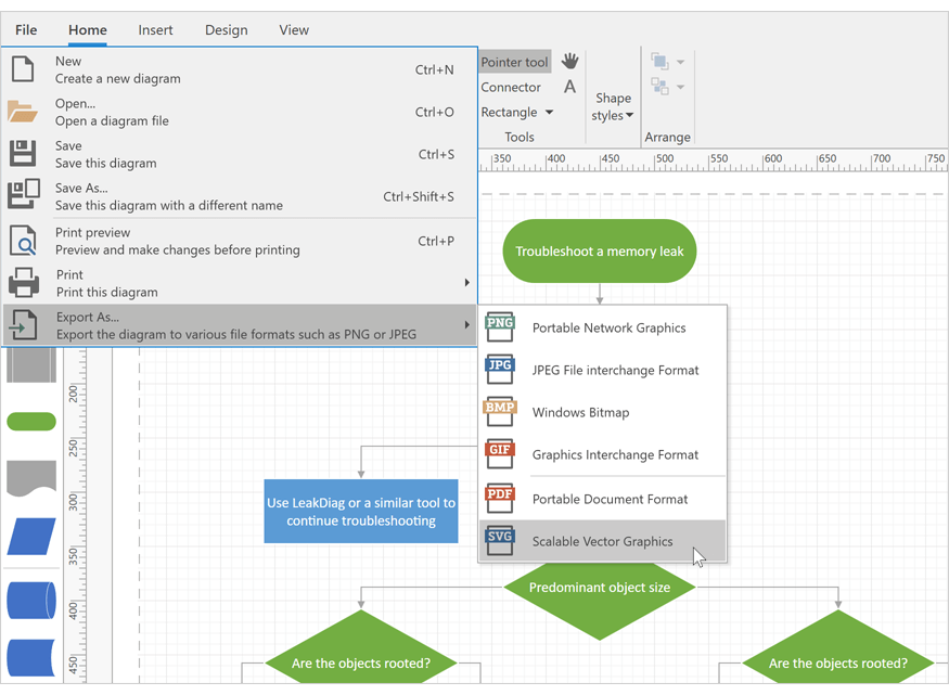
Use SVG images (Optimizacion, perfomance, size of app) ??
Dedicate CSS tags for device pixel ratio (CSS Image Replacement) (the designer can kill me :smile: lol ) see the list http://bjango.com/articles/min-device-pixel-ratio/
CSS Sprite sheet
Another way
Before the decision, think in what is the best to apply in all devices.
Thanks in advance

