I'm developing an Ionic app, and having trouble with my header component. Its elements are wrapping with small screen sizes, and I would like them not to.
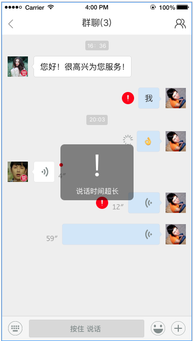
Here's the goal:

Here's what's happening now:

I know I could set a fixed width to the header, but I would like not to. I also wouldn't like to use JavaScript to calculate the width.
Here's the HTML/Angular/Ionic code for the title component:
<h1 *ngIf="backButton; else titleBackButton">{{ title }}</h1> <!-- show if backButton != true -->
<ng-template #titleBackButton> <!-- show if backButton == true -->
  <button ion-button round class="button-back">
    <ion-icon name="arrow-back"></ion-icon>
  </button>
  <h1 class="floated-title">{{ title }}</h1> <!-- this has been floated to the right -->
</ng-template>
Here are my CSS styles:
.button-back {
  margin: 17px 0 0 10px;
}

.floated-title {
  float: right;
}


