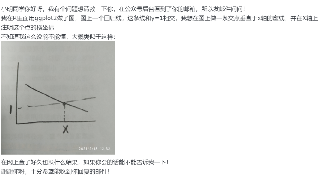
I am trying to create a structure diagram from the data like the following:
mydf <- data.frame ( group = rep (1:5, each = 20), z = rnorm (20, 10, 1),
                  x = c(rnorm (20, 2, 0.5), rnorm (20, 2, 0.5),
          rnorm (20, 9, 0.5), rnorm (20, 9, 0.5),rnorm (20, 5, 0.5)),
       y = c(rnorm (20, 2, 0.5), rnorm (20, 9, 0.5), rnorm (20, 2, 0.5),
      rnorm (20, 9, 0.5), rnorm (20, 2, 0.5)))

means <- aggregate(. ~ group, data = mydf, mean)
gmx <-mean (mydf$x)
gmy <- mean (mydf$y)

library(ggplot2)
ggplot(mydf, aes(x, y)) +
geom_point(aes(colour= factor (group), size=z)) + theme_bw()
I want make connect every points within each cluster to its center and then the cluster center to grad mean. This will be produce a plot like the following (just rough sketch where two cluster are connected to the center, in real all cluster have the same):.........
(I would like to use the line segments of same color as of cluster if possible)


