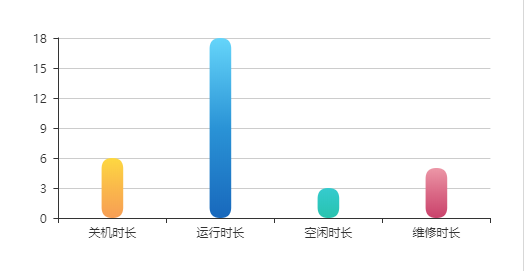
I have chart looking like that:

I use measure axis for Y:
y = myChart.addMeasureAxis("y", "rate");
y.tickFormat = ",.4f";
As you can see ticks starts from 0.0000 while data has values starting from a bit above 3.0000.
Is it possible to display y ticks starting from 2.5000 for example?
I tried:
y.overrideMin = 2;
but it does not work as I expect. The x axis disappears:
 Thank you.
I'm afraid overriding minimum axis values is a little suboptimal at the moment. There is a workaround but it's a bit of a hack. Basically you just hide the x axis entirely and draw a second chart with no series over the top, hiding the second chart's y axis.
So after drawing do:
c2 = new dimple.chart(svg, data);
c2.addCategoryAxis("x", "Day");
c2.addMeasureAxis("y", "Value").hidden = true;
c2.draw();
The two axes meet up nicely and look the way you would want.
Here is a working example:
http://jsfiddle.net/87GHM/2/
I was also stuck in this issue. Couldn't find how lower the number of 'ticks' on the y-axis. The library doesn't expose any method for that. So, I tinkered with the library to suit my needs. So it's a hack ^_^
Use the commented version of the library i.e dimple.v1.1.4.js
Find the line ~338
if (!this.hidden) {
                switch (this.chart._axisIndex(this, "y")) {
                case 0:
                    this._draw = d3.svg.axis()
                        .orient("left")
                        .scale(this._scale)
                        .ticks(5);   <<<<<<<<<------ This wasn't there before
                    break;
                case 1:
                    this._draw = d3.svg.axis()
                        .orient("right")
                        .scale(this._scale);
                    break;
                default:
                    break;
                }
            }
Add the ticks(5) or whatever number you want.
Same results could be reached with just CSS and no JS:
#your-graph .dimple-axis-x {
  g.tick text {
    opacity: 0;
  }

  g.tick:nth-child(10n) text {
    opacity: 1;
  }
}

 Thank you.


