I'm trying to implement validation in my WPF application using the IDataErrorInfo interface, and I've encountered a not-so-desirable situation.
I have this template which is used when a control fails to validate
<ControlTemplate x:Key="errorTemplate">
    <DockPanel LastChildFill="true">
        <Border Background="Red" DockPanel.Dock="Right" Margin="5,0,0,0" Width="20" Height="20" CornerRadius="10"
                                    ToolTip="{Binding ElementName=customAdorner, Path=AdornedElement.(Validation.Errors)[0].ErrorContent}">
            <TextBlock Text="!" VerticalAlignment="Center" HorizontalAlignment="Center" FontWeight="Bold" Foreground="White" />
        </Border>
        <AdornedElementPlaceholder Name="customAdorner" VerticalAlignment="Center" >
            <Border BorderBrush="red" BorderThickness="1" />
        </AdornedElementPlaceholder>
    </DockPanel>
</ControlTemplate>
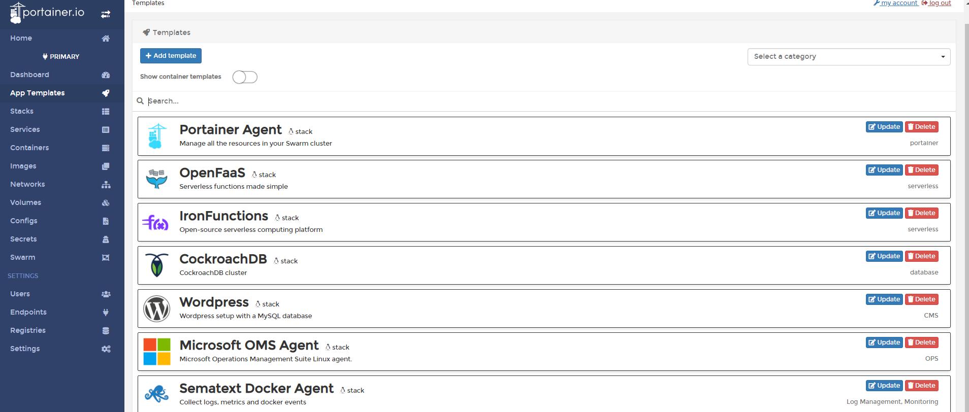
Everything is well until I try to display something above the control that failed validation, such as displaying a dock item above it:


How can I avoid this and make my error template displayed below the dock item, as it should?
EDIT
I found that I could wrap my TextBox with an AdornerDecorator to fix this, but I really don't want to do this for each and every TextBox control in my application. Is there maybe a way to set it with a Style or some other way?
EDIT 2
I could probably change the default TextBox ControlTemplate to include an AdornerDecorator, but I'm not too keen on changing any of WPF's default control templates. Any other suggestions are welcome.
OK, I found a relatively simple solution which doesn't force me to change any control templates.
Instead of decorating each TextBox with an AdornerDecorator like this
<StackPanel>
    <AdornerDecorator>
        <TextBox Text={Binding ...} />
    </AdornerDecorator>
    <AdornerDecorator>
        <TextBox Text={Binding ...} />
    </AdornerDecorator>
</StackPanel>
I can have the AdornerDecorator wrap my entire view, which achieves the same result.
<AdornerDecorator>
    <StackPanel>
        <TextBox Text={Binding ...} />
        <TextBox Text={Binding ...} />
    </StackPanel>
</AdornerDecorator>
This way I can define it at most one time per view.
Based on @AdiLester great answer, if your controls are deriving from a base class and you don't want to put AdornerDecorator in XAML of each control, then go this way:
public class MyBaseUserControl : UserControl
{
    public MyBaseUserControl()
    {

    }

    protected override void OnContentChanged(object oldContent, object newContent)
    {
        base.OnContentChanged(oldContent, newContent);

        if (!(newContent is AdornerDecorator))
        {
            this.RemoveLogicalChild(newContent);

            var decorator = new AdornerDecorator();
            decorator.Child = newContent as UIElement;

            this.Content = decorator;
        }
    }
}
I would use a style, and here here's an example of one that you can easily adapt.
Note that the ErrorContent is coming from (Validation.Errors).CurrentItem.ErrorContent as opposed to Errors[0]. Although both will work, the latter will litter your output window with swallowed exceptions as outlined here.
<Style x:Key="TextBoxStyle" TargetType="{x:Type TextBox}">
    <Setter Property="Margin" Value="0,0,16,0" />
    <Setter Property="VerticalAlignment" Value="Center" />
    <Setter Property="VerticalContentAlignment" Value="Center" />

    <!--
    Error handling
    -->
    <Setter Property="Validation.ErrorTemplate">
        <Setter.Value>
            <ControlTemplate>
                <DockPanel LastChildFill="True">
                    <TextBlock DockPanel.Dock="Right" Text=" *"
                               Foreground="Red" FontWeight="Bold" FontSize="16"
                               ToolTip="{Binding ElementName=placeholder, Path=AdornedElement.(Validation.Errors).CurrentItem.ErrorContent}"/>
                    <Border BorderBrush="Red"  BorderThickness="1">
                        <AdornedElementPlaceholder Name="placeholder"></AdornedElementPlaceholder>
                    </Border>
                </DockPanel>
            </ControlTemplate>
        </Setter.Value>
    </Setter>
    <Style.Triggers>
        <Trigger Property="Validation.HasError" Value="True">
            <Setter Property="Background" Value="LightYellow"/>
        </Trigger>
    </Style.Triggers>
</Style>


