Google charts X-axis don't look so good

2020-07-30 04:15发布

问题:

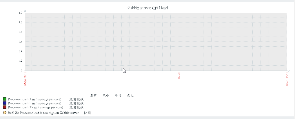
I draw a chart using google charts API. and i get this chart:

My problem in this chart is the X-axis. The labels are not in look so good. if I have more Strings in X-axis it's look like this:

I think the problem is because the X column type is string and not DATETIME. How i change the column type in google charts? Or How i change the X-axis without changin the column type? I add the script here below...

PHP code:

$connection = mysql_connect('127.0.0.1','root','123456');
mysql_select_db('db_statmarket',$connection);

$result2 = mysql_query('select sum(`How much read from customer`) as Leads, Date from monitor group by Date;',$connection) or die('cannot show tables');

$json = array();
while($row = mysql_fetch_assoc($result2)) {
    $json[] = $row;
}

$str='[\'Date\', \'Leads\'],';
foreach($json as $key=>$value){

$str = $str.'['.'\''.$value["Date"].'\''.', '.$value["Leads"].'],'; 

}
$str = substr($str, 0, -1);
$str = '['.$str.']';
    $result1 = mysql_query('SELECT * FROM monitor ORDER BY customer_id DESC LIMIT 1;',$connection) or die('cannot show tables');
    $row = mysql_fetch_assoc($result1);

JS code:

  google.setOnLoadCallback(drawChart);

  function drawChart() {

    var data = google.visualization.arrayToDataTable(<?php echo $str?>);

    var options = {
        title: '',
        curveType: 'function',
        legend: { position: 'bottom' },
        width: 1000,
        backgroundColor: '#efeff0',
        is3D: true,
        chartArea: {
        backgroundColor: {
                       stroke: '#efeff1',
                       strokeWidth: 1}},
        height: 300

    };

    var chart = new google.visualization.LineChart(document.getElementById('curve_chart'));

    chart.draw(data, options);

HTML code:

<div id="curve_chart" class="plot" style="width: 50% ; height: 400px ; float:left; margin-left:9%;"></div>

Thanks!

回答1:

I found The answer.

I share It for all. so if somebody stuck, like me. will continue with this help quickly.

I create new variable: var showEvery = parseInt(data.getNumberOfRows() / 4);

And in the option attribute i add: hAxis: {showTextEvery: showEvery}

so the JS code seems like this:

    var data = google.visualization.arrayToDataTable(<?php echo $str?>);

    var show = parseInt(data.getNumberOfRows() / 4);

    var options = {
        title: '',
        curveType: 'function',
        legend: { position: 'bottom' },
        width: 1000,
        backgroundColor: '#efeff0',
        is3D: true,
        chartArea: {
        backgroundColor: {
                       stroke: '#efeff1',
                       strokeWidth: 1}},
        hAxis: {showTextEvery: showEvery},
        height: 300
    };

    var chart = new google.visualization.LineChart(document.getElementById('curve_chart'));

    chart.draw(data, options);


回答2:

You can force the x-axis of a BarChart setting the hAxis.viewWindow.min and hAxis.viewWindow.max:

hAxis: {
    viewWindow: {
        min: 0,
        max: 100
    },
    ticks: [0, 50, 100] // display labels every 50
}

This will work for numbers or percentages, to use with dates is a bit more complex: checking Customizing Axes in Google API, there are two solutions:

  • You can change your major X axis to discrete and date type

The major axis of a chart can be either discrete or continuous. When using a discrete axis, the data points of each series are evenly spaced across the axis, according to their row index. When using a continuous axis, the data points are positioned according to their domain value.

  • Read, in the Customizing Axes link part which starts with Help! My chart has gone wonky! where explains the steps how to change from date to string and then customize it...