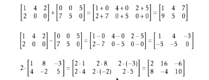
I wish to create a [ and ] bracket just with CSS. Is there a way to specify the top and bottom border (Without slicing the image) so it looks like a bracket?
.bracket {
  border-top:20px;
  border-bottom:20px;
  border-right:none;
  border-left: 1px solid black;
}
.b:after {
  content: "]"
}

.b:before {
  content: "["
}
<span class="b">text</span>
working example: http://codepen.io/yardenst/pen/bhGIy
You can draw square brackets without the use of any pseudo elements in pure css.
Steps:
- Create an element like
<div> or <span> and make it an inline-block so that its length becomes dependent on its content i.e length of this element will be as long as content inside it.
- Apply left / right borders.
- Use
linear-gradient() to create 4 background images with specific width / height and draw on each corner of the box with background-position. The height factor of background-size should be equal to border-left-width.
Necessary CSS:
div {
  background-image: linear-gradient(#ffb1bb, #ffb1bb),
                    linear-gradient(#ffb1bb, #ffb1bb),
                    linear-gradient(#ffb1bb, #ffb1bb),
                    linear-gradient(#ffb1bb, #ffb1bb);

  background-repeat: no-repeat;
  background-size: 8px 3px;
                    // ^^^ This value should be equal to width of left OR right border.
  background-position: top left, top right, bottom left, bottom right;

  border: solid #ffb1bb;
  border-width: 0 3px;
}
Useful Resources:
Linear Gradient: MDN, W3.
Background Image: MDN, W3.
Output Image:

* {box-sizing: border-box;}

body {
  background: linear-gradient(white, silver);
  min-height: 100vh;
  margin: 0;
}

.widget-title {
  font: 20px/26px Arial, sans-serif;
  background-image: linear-gradient(#ffb1bb, #ffb1bb),
    linear-gradient(#ffb1bb, #ffb1bb),
    linear-gradient(#ffb1bb, #ffb1bb),
    linear-gradient(#ffb1bb, #ffb1bb);

  background-repeat: no-repeat;
  background-size: 8px 3px;
  background-position: top left, top right, bottom left, bottom right;

  border: solid #ffb1bb;
  text-align: justify;
  border-width: 0 3px;
  display: inline-block;
  vertical-align: top;
  padding: 5px 15px;
  margin: 20px;
}
<h4 class="widget-title widgettitle">WHAT’S NEW</h4>

<h4 class="widget-title widgettitle">This is some dummy and multiline text and nothing meaning in this sentence,This is some dummy and multiline text and nothing meaning in this sentence,This is some dummy and multiline text and nothing meaning in this sentence...</h4>
You can use the :after and :sbefore pseudo-elements, with the content property.
More info
Something like
.bracket:after { content: ']' }
.bracket:before { content: '[' }
Not directly, but you can do this instead:
HTML:
<div class="wrapper">
<div class="left">
<div class="stick"></div>
<div class="empty"></div>
<div class="stick"></div>
</div>
<div class="content">Div content</div>
<div class="right">
<div class="stick"></div>
<div class="empty"></div>
<div class="stick"></div>
</div>
</div>
CSS:
.wrapper{
    border-bottom: 2px solid #FF0000;
    border-top: 2px solid #FF0000;
    height: 100px;
    width: 300px;
}
.stick{
    border-left: 2px solid #FF0000;
    height: 33%;
}
.empty{
    height: 34%;
}
.content{ float: left }
.left{ float: left; height: 100%; }
.right{ float: right; height: 100%; }
.clear{ clear: both }
Demo: http://jsfiddle.net/Q8g4F/
This is possible by usage of container's :before and :after pseudo elements.
Sass code:
$container-selector: h1;
$bg-color: white;
$bracket-color: orange;
$bracket-width: 10px;
$bracket-length: 30px;
// just reset
body {
  background-color: $bg-color;
}

// not really related
$container-selector {
  padding: 0 30px;
}

$container-selector {
  position: relative;
  border: $bracket-width solid $bracket-color;
  &:before,
  &:after {
    content: "";
    display: block;
    position: absolute;
    top: -$bracket-width;
    right: $bracket-length - $bracket-width;
    left: $bracket-length - $bracket-width;
    height: $bracket-width;
    background-color: $bg-color;
  }
  &:after {
    top: initial;
    bottom: -$bracket-width;
  }
}
Working example is available here: https://jsfiddle.net/1uuodzdw/


