I have been using SSRS 2012 (Sql Server Reporting Services) with SQL Server Report Builder 3.0 (11.0.2100.60) to create Column charts that display columns for each day/week/month and display a trend line based on the mean across all days/weeks/months.
However, although the calculated series reflects only 1 value (the mean across all days/weeks/months), value labels appear on the chart displaying the single mean value for each day/week/month - that is, 3 days will result in 3 value labels for the same mean value.
Is there a way to force the series to show only 1 value for each mean trend line?
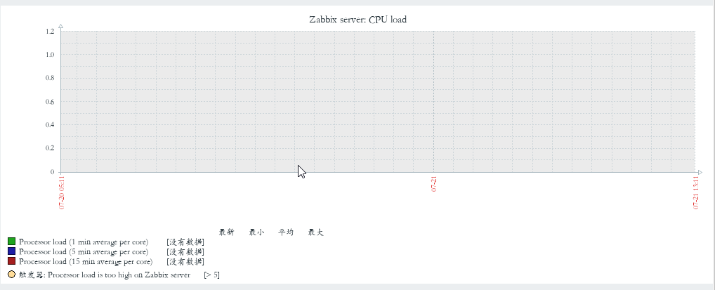
See below for sample chart.
The work-around I ultimately settled on involved creating duplicate series with value labels but invisible data points (obtained by setting Color to "No Color").
The values for this series are only assigned if the "dayofweek" field matches the first "dayofweek" field in the dataset, so only 1 data label will be displayed (namely, the first one).
For example, to show a single value for the average of the "physio" field for physiological alarms within my dataset ("techphysDayofWeek", I use the following formula):
=IIF(Fields!dayofweek.Value = First(Fields!dayofweek.Value,
"techphysDayofWeek"),Format(( Avg(Fields!physio.Value, "techphysDayofWeek") /
Parameters!StartDate.Value), "##.#"), "")
I wish SSRS provided an easier way, but after struggling with this seemingly simple issue for hours on end, I'm just glad to have any fix!

You can set the label text to be based on a formula. In that formula you could look at the value of the grouping field, and set the text to an empty string if it's not currently the group you want to have the label on.


